Discern
Discern is a web-based platform that uses intelligent monitoring and automation to make U.S. corporate compliance more efficient and easier to manage. I worked with Discern in 2022–2023 to design the brand’s visual identity, including a logo system, color palette, and a comprehensive visual style guide.
Summary
Corporate compliance is often a significant burden for growing companies due to its complexity and the time and resources required to manage it. Discern’s web-based platform reduces this burden by automating the monitoring and filing of foreign registrations, annual reports, and franchise tax.
From 2022–2023, I partnered with Discern to design a visual identity that would support their growth and reflect their values. The project began with a series of discovery sessions focused on the product, brand positioning, and target audience. Together, we defined a strategy that balanced trust and professionalism with a modern, technology-forward sensibility.
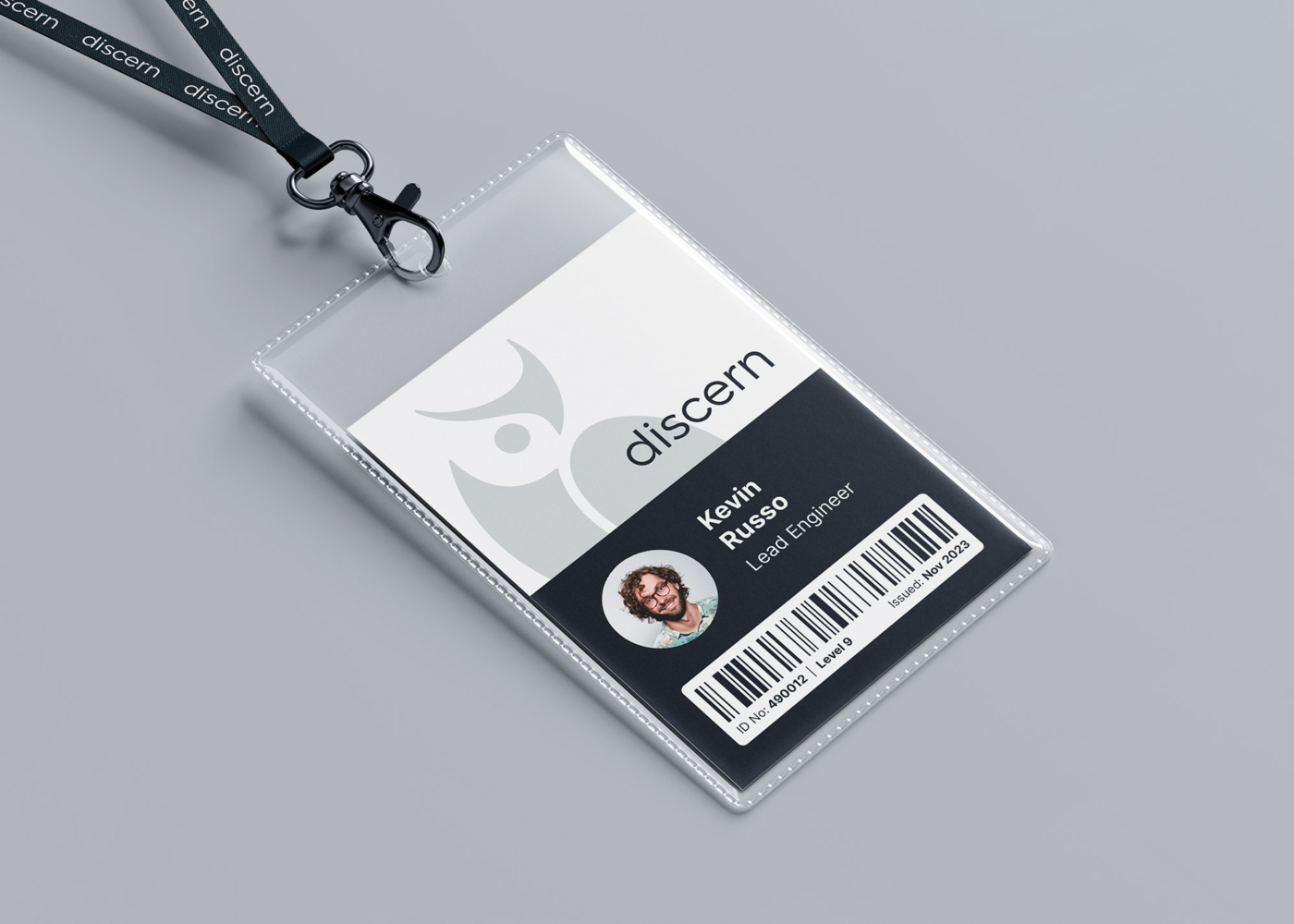
The resulting identity includes a logomark, brandmark, combination lockups, color palette, typography, and favicons. These elements were designed to reflect Discern’s core attributes while creating a flexible foundation that can scale with the brand. An in-depth style guide supports internal and external teams in maintaining consistency across every application.
Project Details
- Client
- Discern
- Location
- New York
- USA
- Industry
- Technology
- Entity Management
- Completed
- 2023
- Typography
- Product Design

Visual Identity
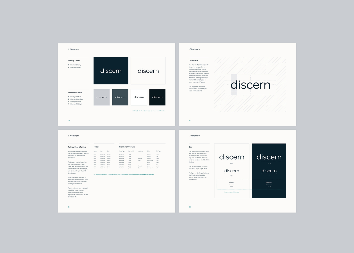
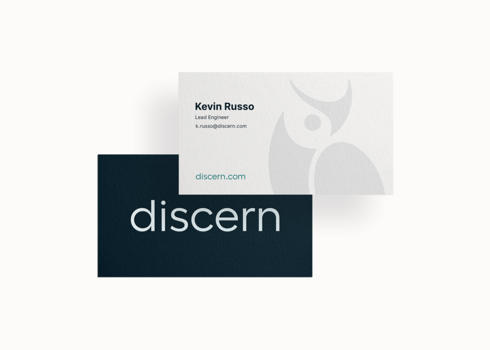
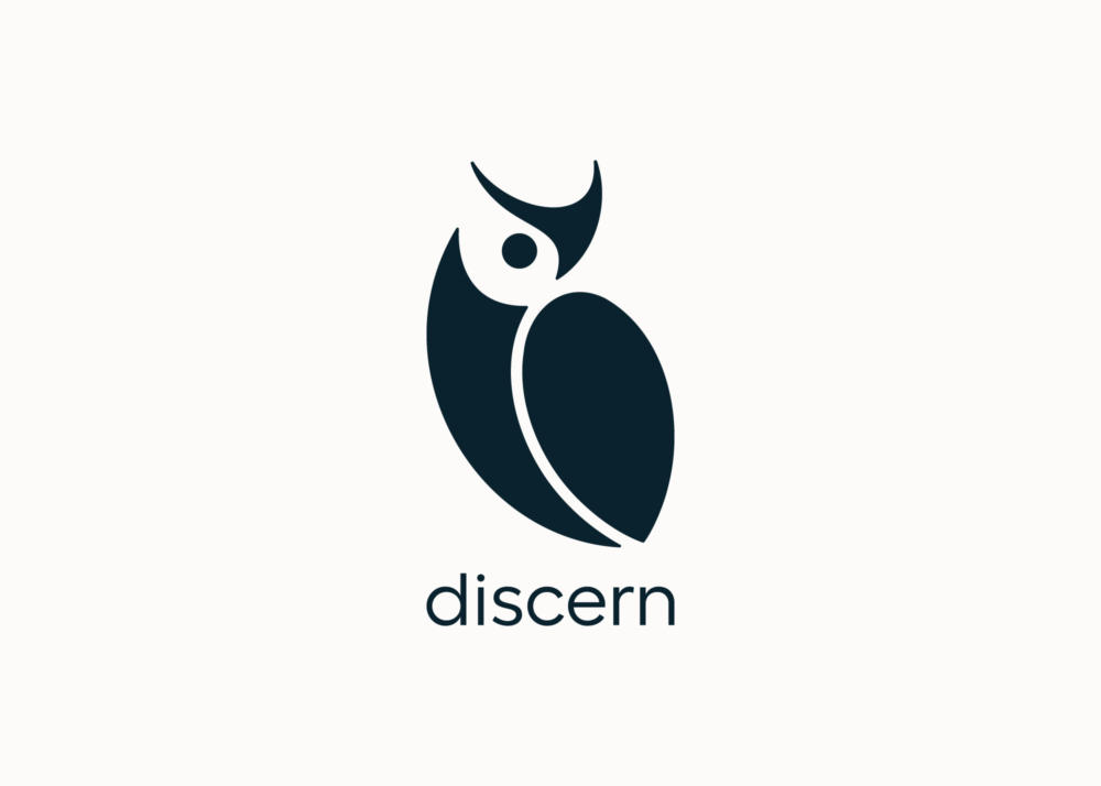
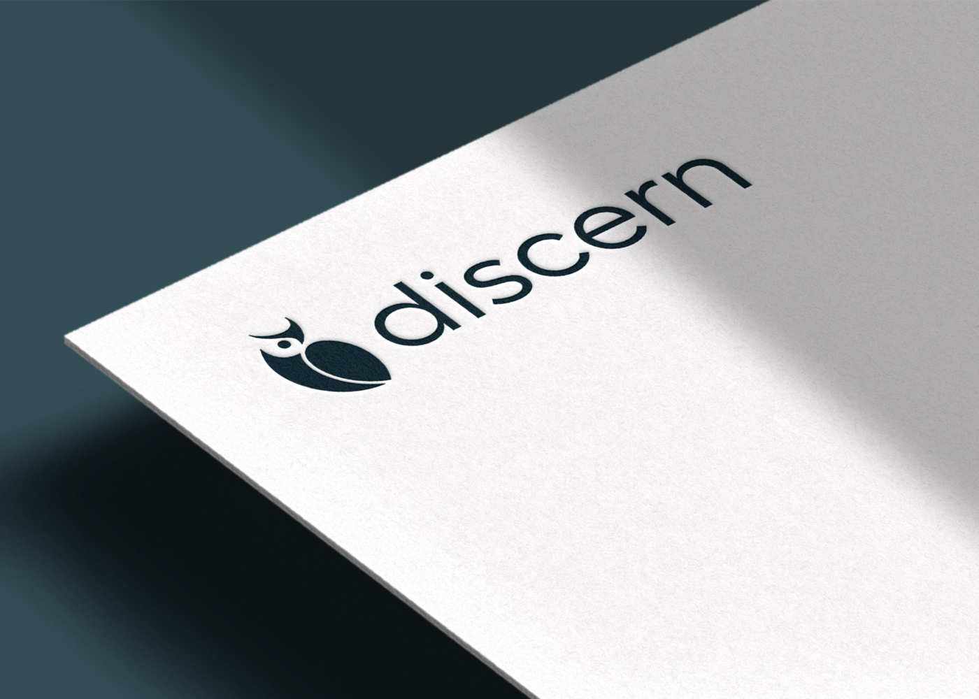
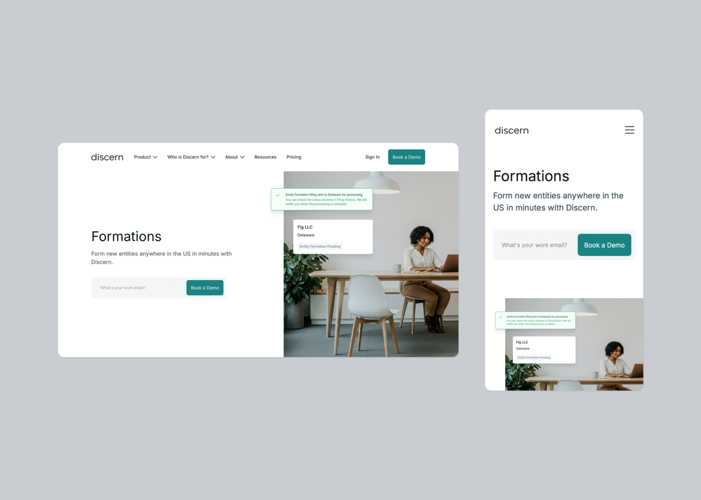
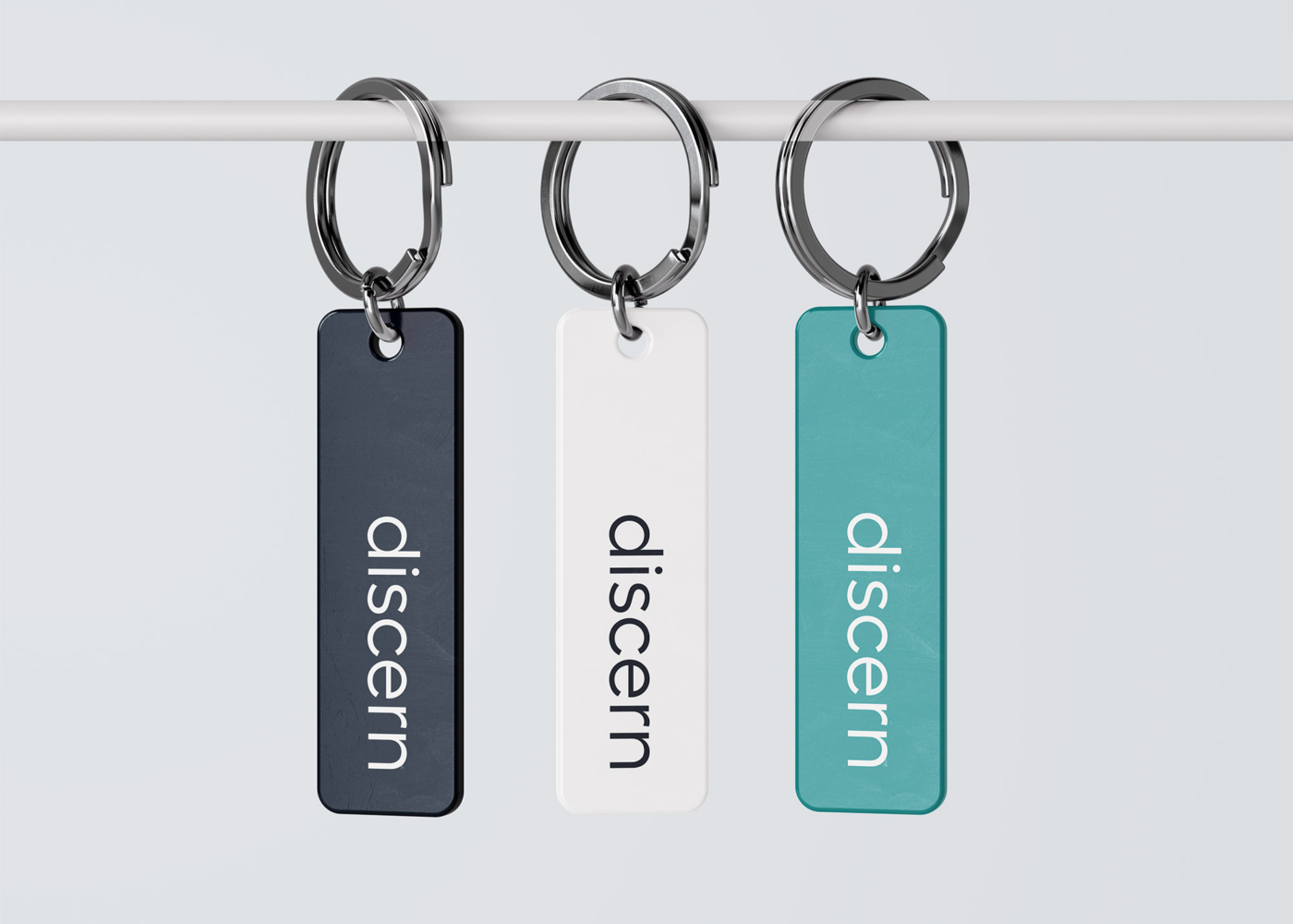
The visual identity for Discern includes a primary logo, alternate lockups, brand colors, and supporting design elements—each created to convey clarity, professionalism, and trust. The system is built around a geometric wordmark and a custom-drawn owl brandmark, which can be used independently or in flexible lockups.

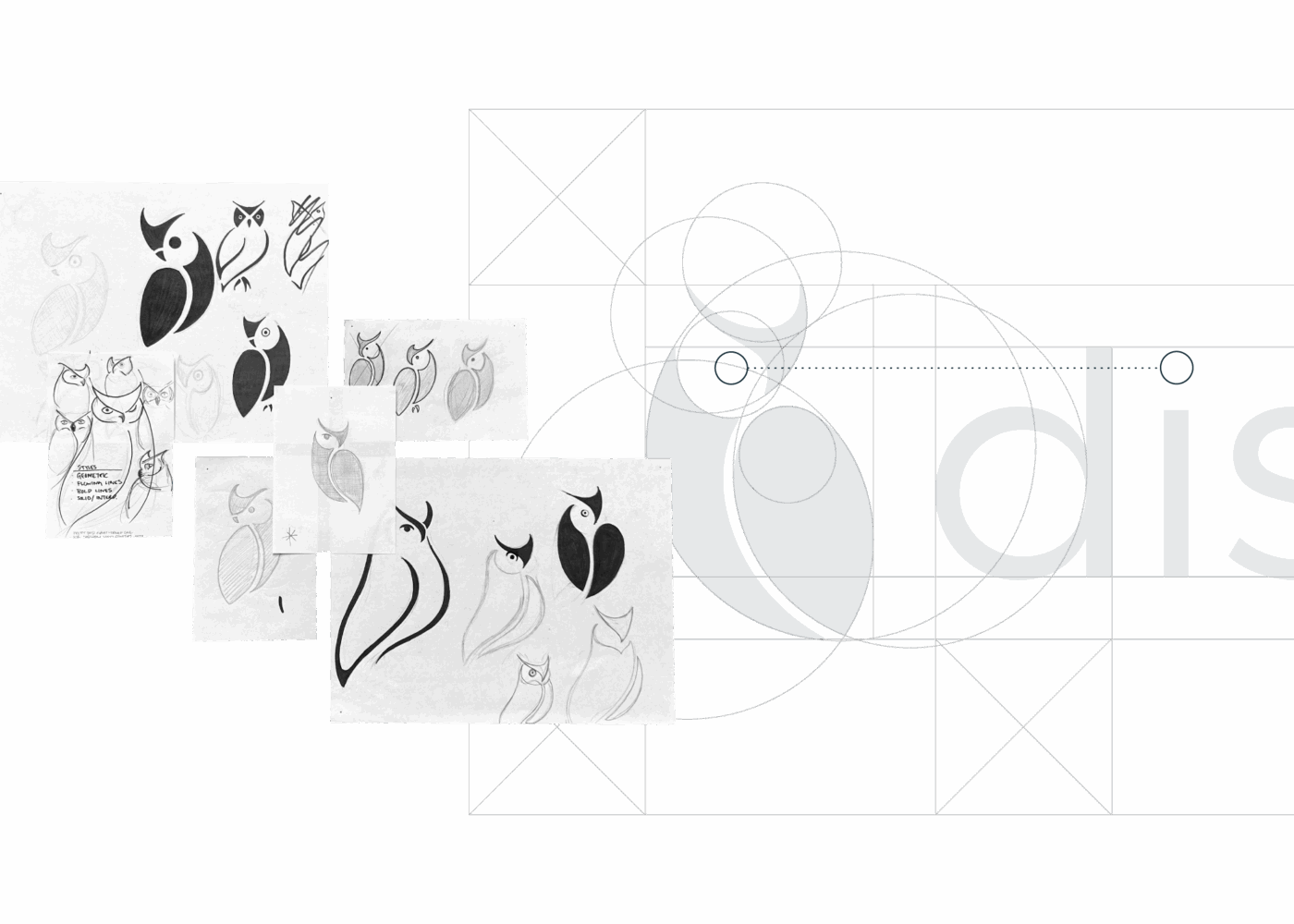
Process & Anatomy
The wordmark began with a rigorous type selection process—sorting through hundreds of options to find one that balanced professionalism with personality. Once selected, the letterforms were customized for improved legibility, spacing, and clarity, resulting in a precise, confident mark that reflects the brand’s tone.
Rooted in the concept of insight, the owl brandmark was developed through an iterative sketch and refinement process. The final mark distills the owl form into clean, geometric shapes—conveying focus, intelligence, and a quiet sense of authority.
Brand Color
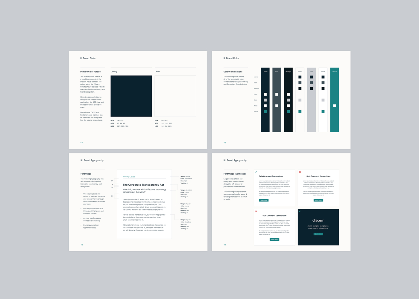
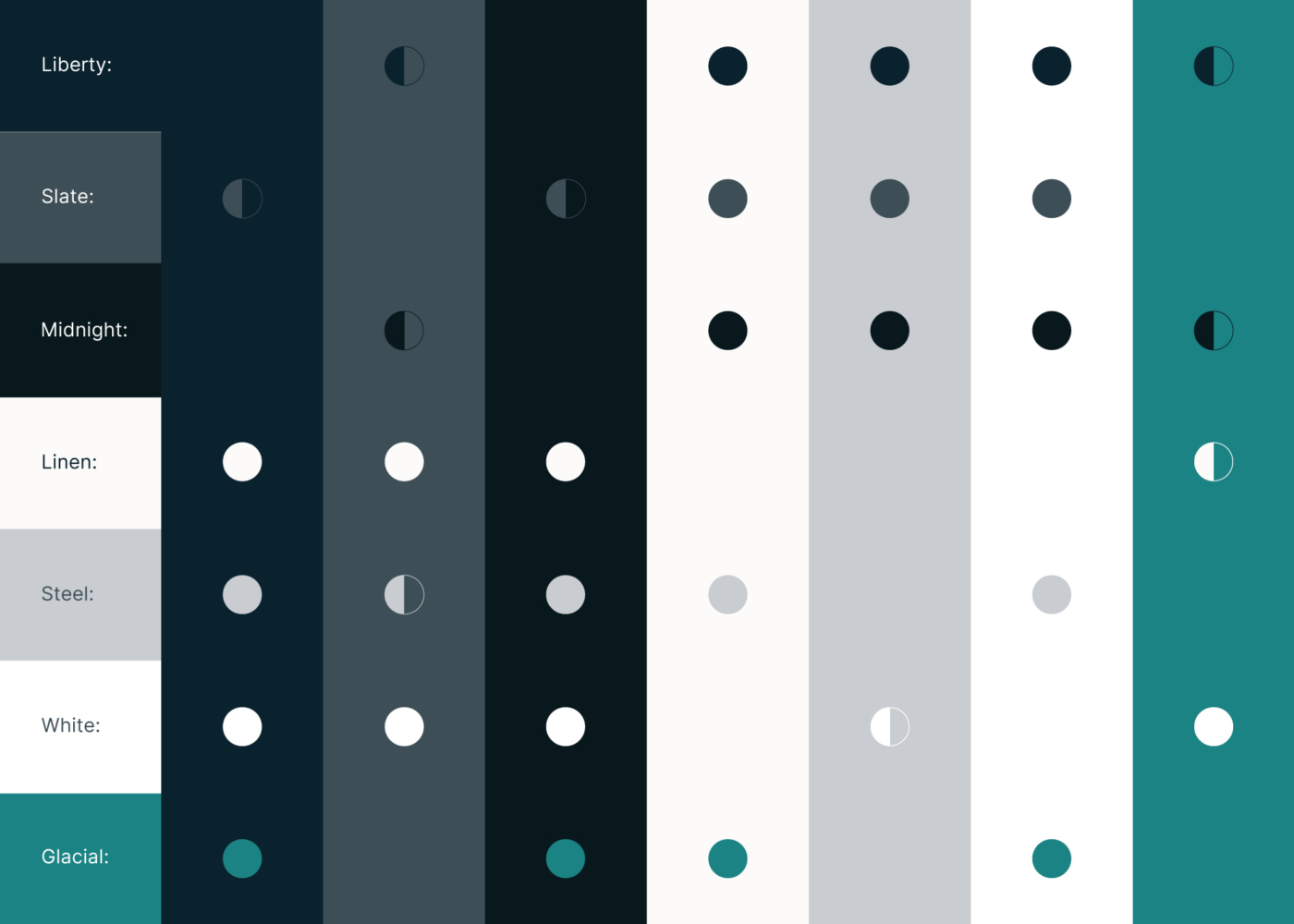
Discern’s color palette builds on the qualities of the logo—clear, structured, and approachable. The core combinations are ADA compliant and designed to work across digital and print formats with strong contrast and visual consistency.

Visual Style Guide
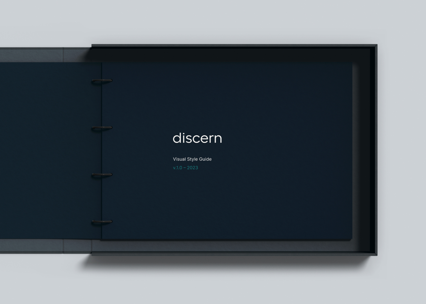
To support long-term brand consistency, a 50+ page visual style guide was created. The guide documents the full identity system and includes practical guidance for applying logos, color, and typography. It also provides layout suggestions and space for future tools—giving the Discern team a reliable foundation as the brand grows.
