
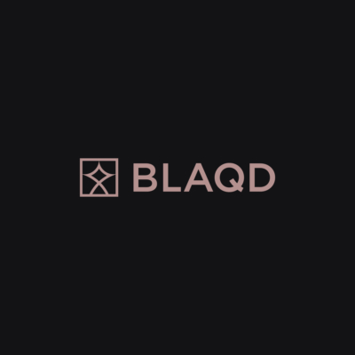
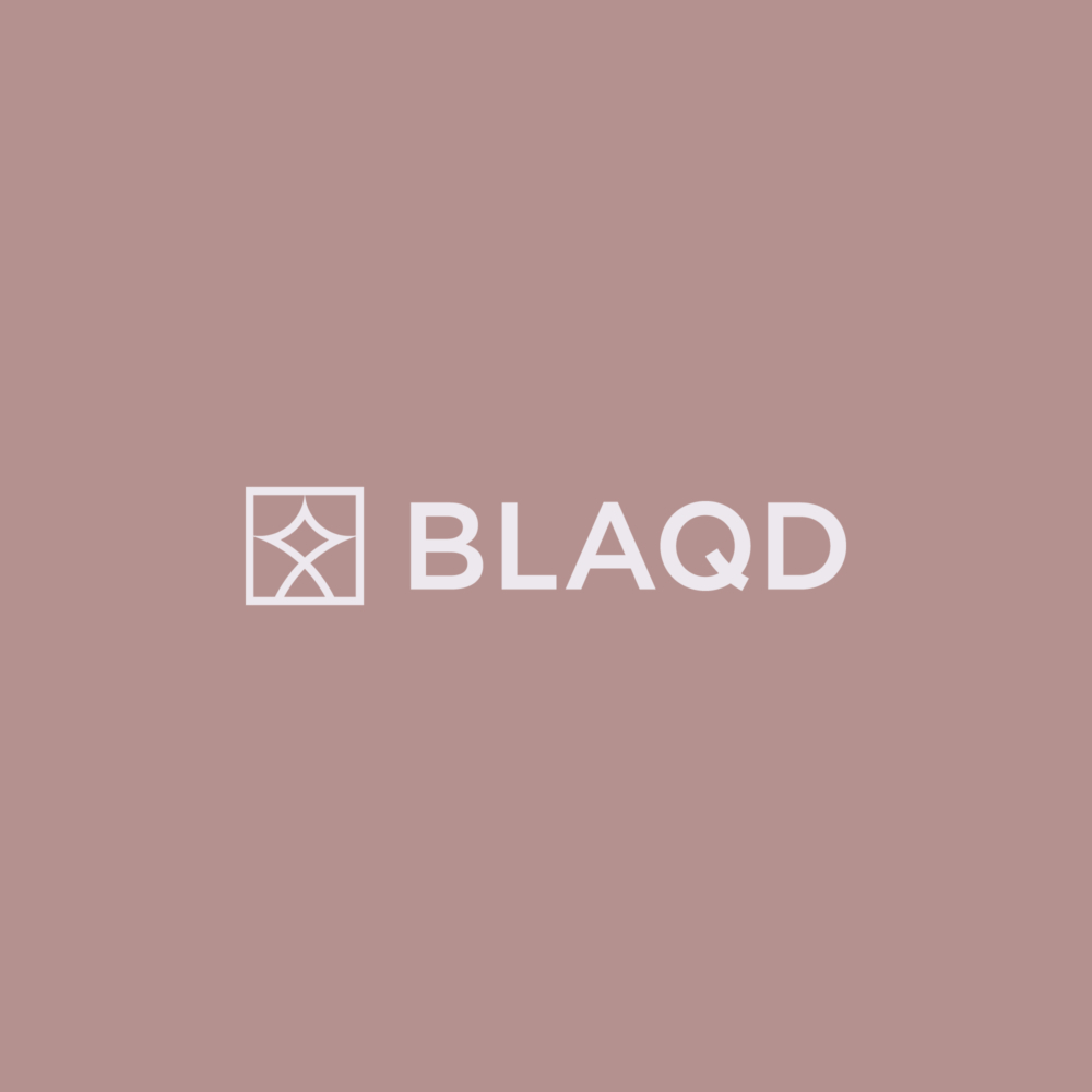
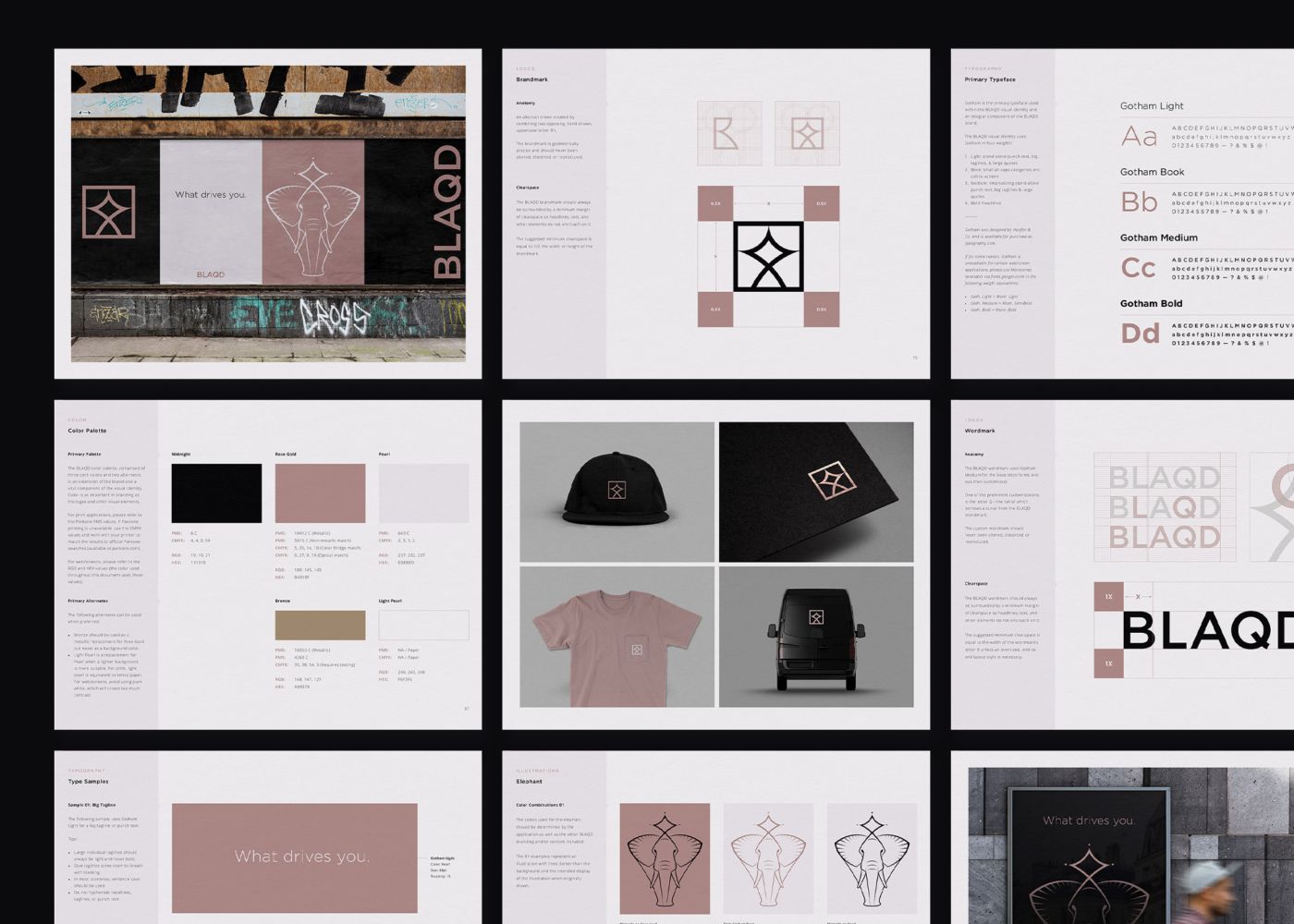
BLAQD
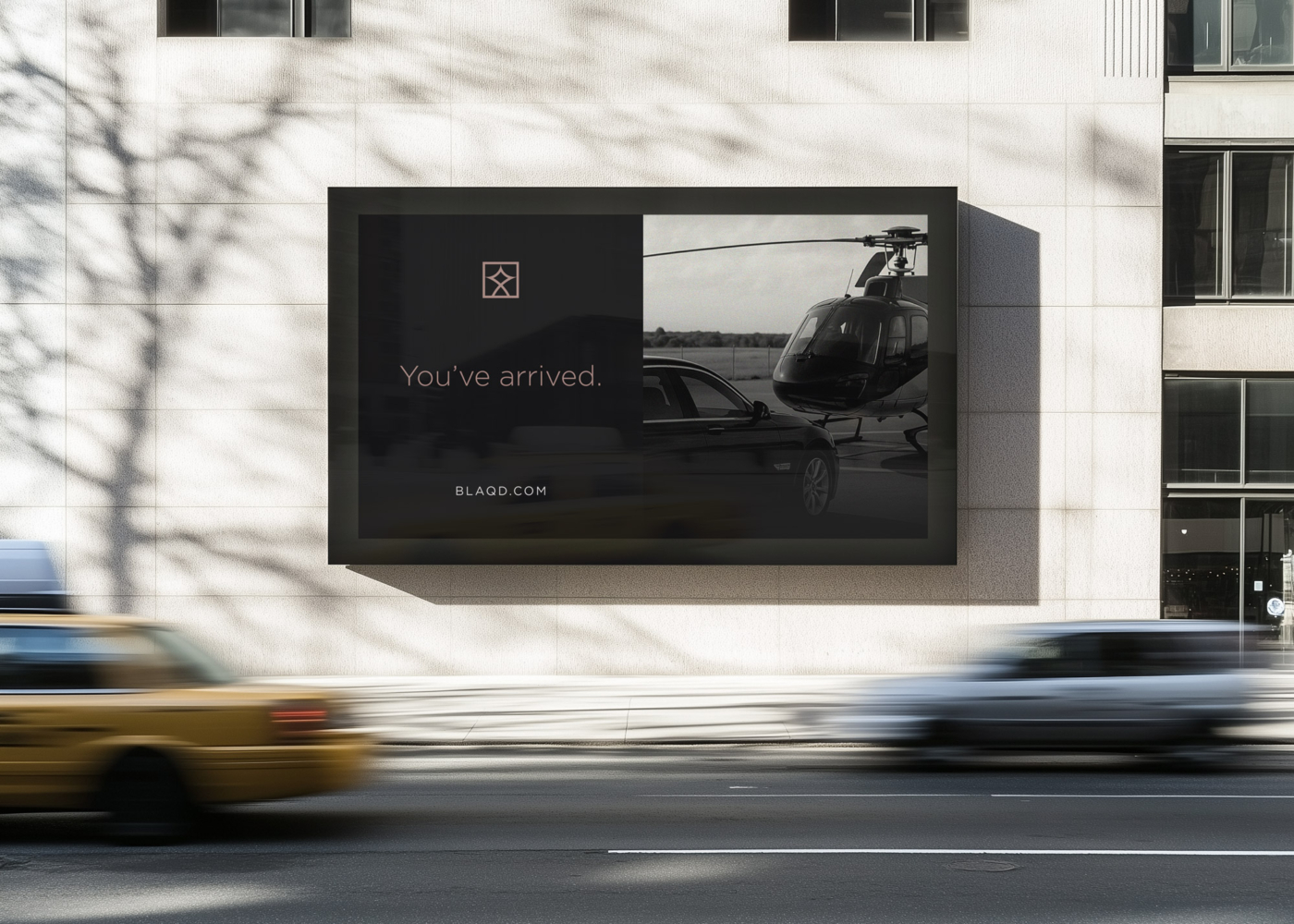
BLAQD is a luxury transportation brand built around the promise of elevated travel—offering style, safety, and exclusivity through a fleet of custom-designed vehicles. Contracted by Skatzka Agency in 2022, I was responsible for designing the complete visual identity system for the brand, which aimed to appeal to a broad but discerning audience across Florida and beyond.
Project Details
- Client
- Skatzka Agency
- Blaqd
- Location
- Florida
- USA
- Industry
- Transportation
- Completed
- 2022
- Copywriting
- Jeffrey Skatzka

The Logos
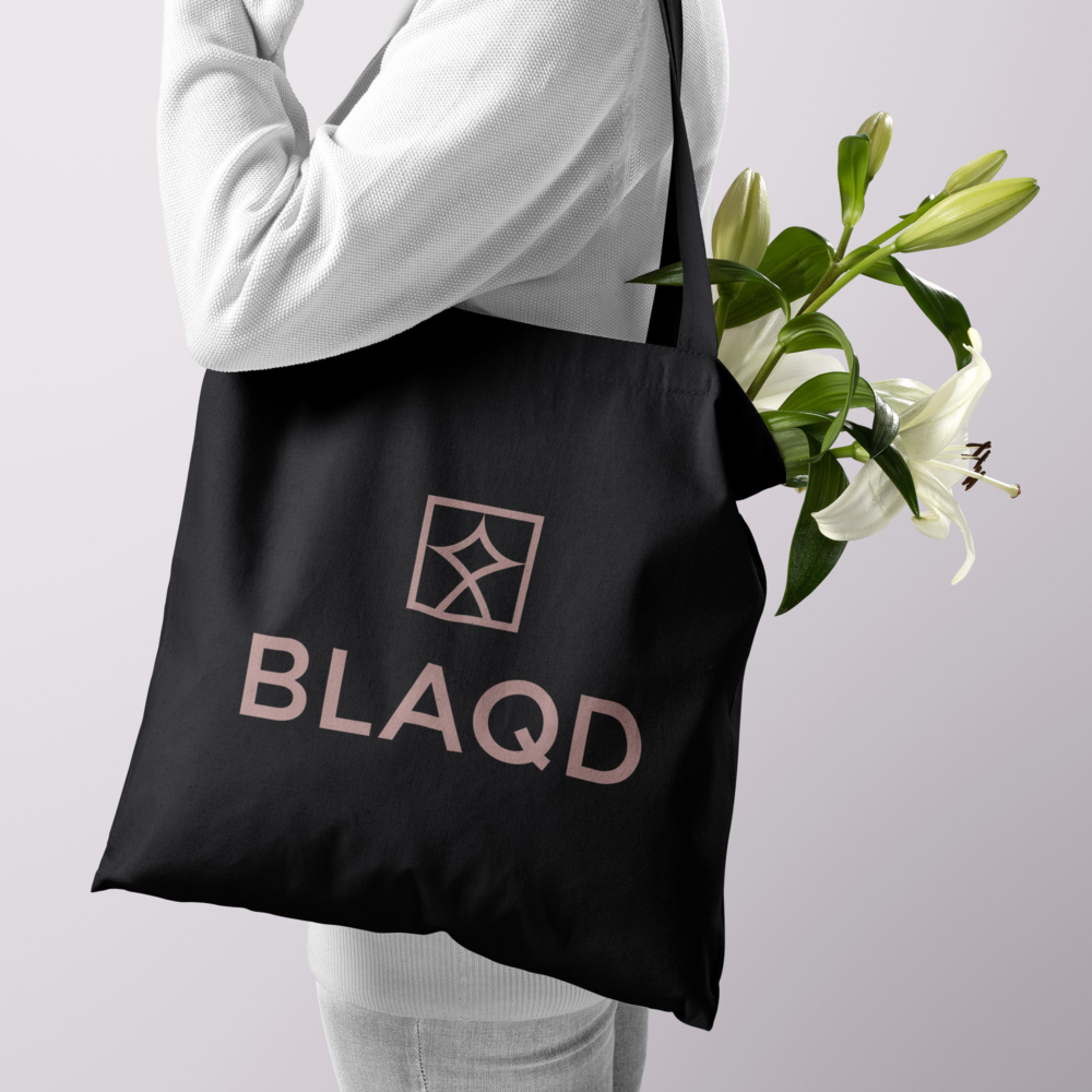
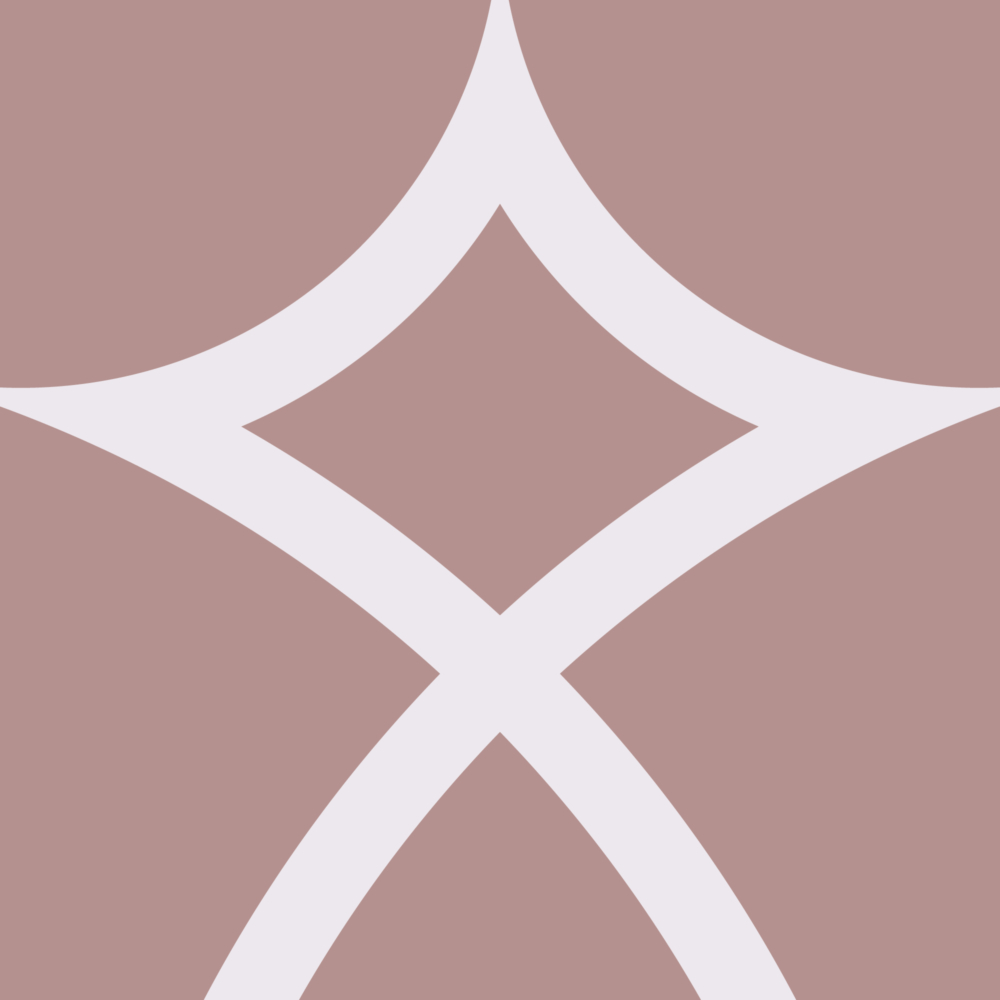
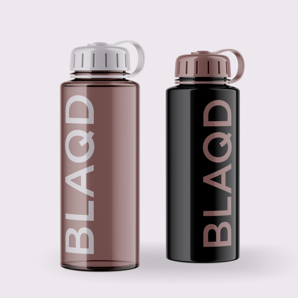
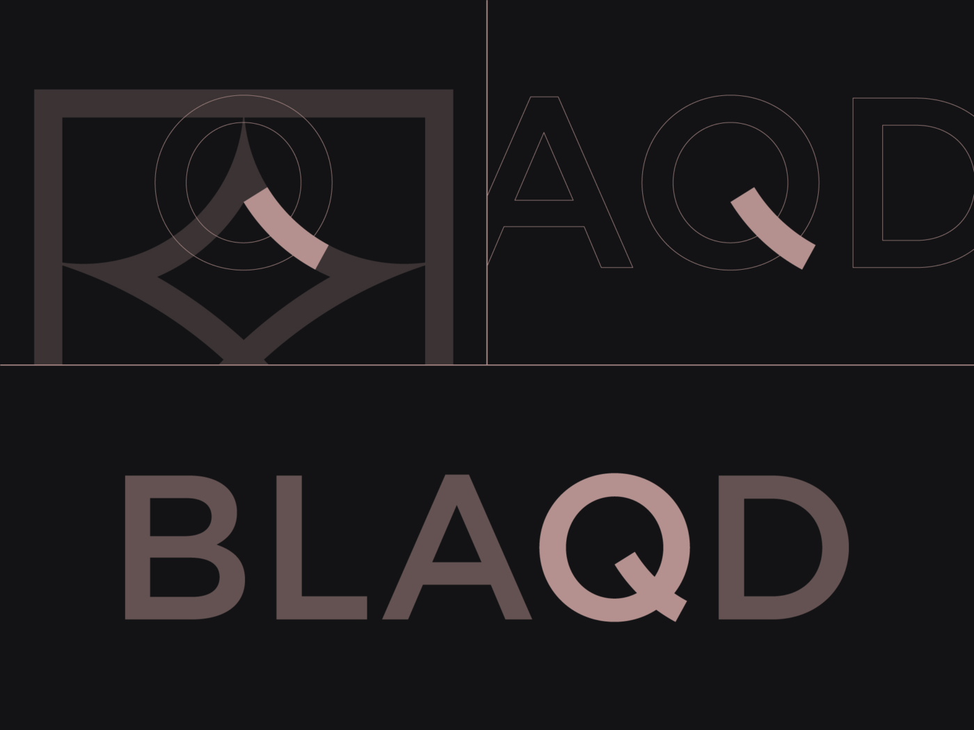
The BLAQD identity centers around a tightly constructed set of logos—each one rooted in symmetry, structure, and visual restraint. At the system’s core is a geometric crown, constructed from two opposing uppercase B’s and paired with a customized wordmark. Together, these components form adaptable lockups for use across print, digital, and environmental applications.


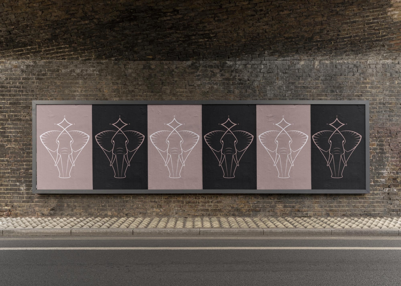
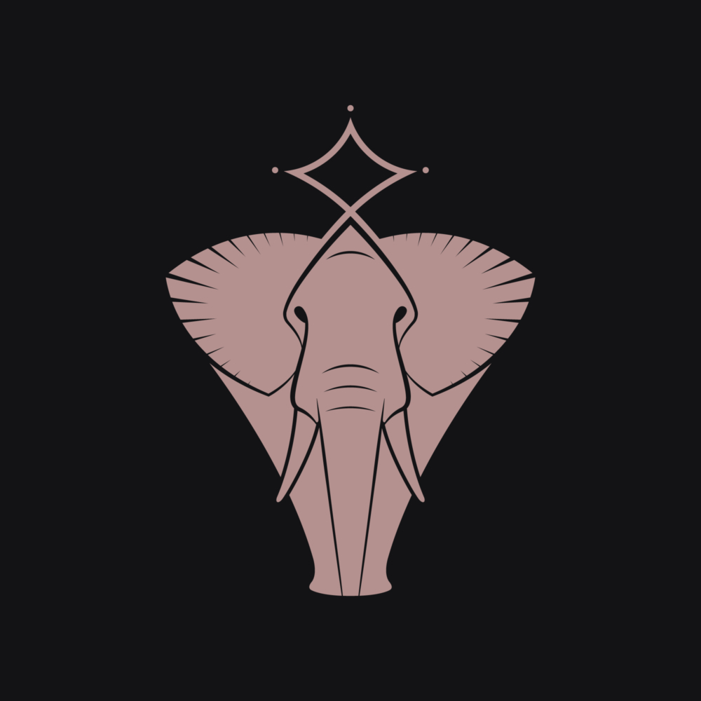
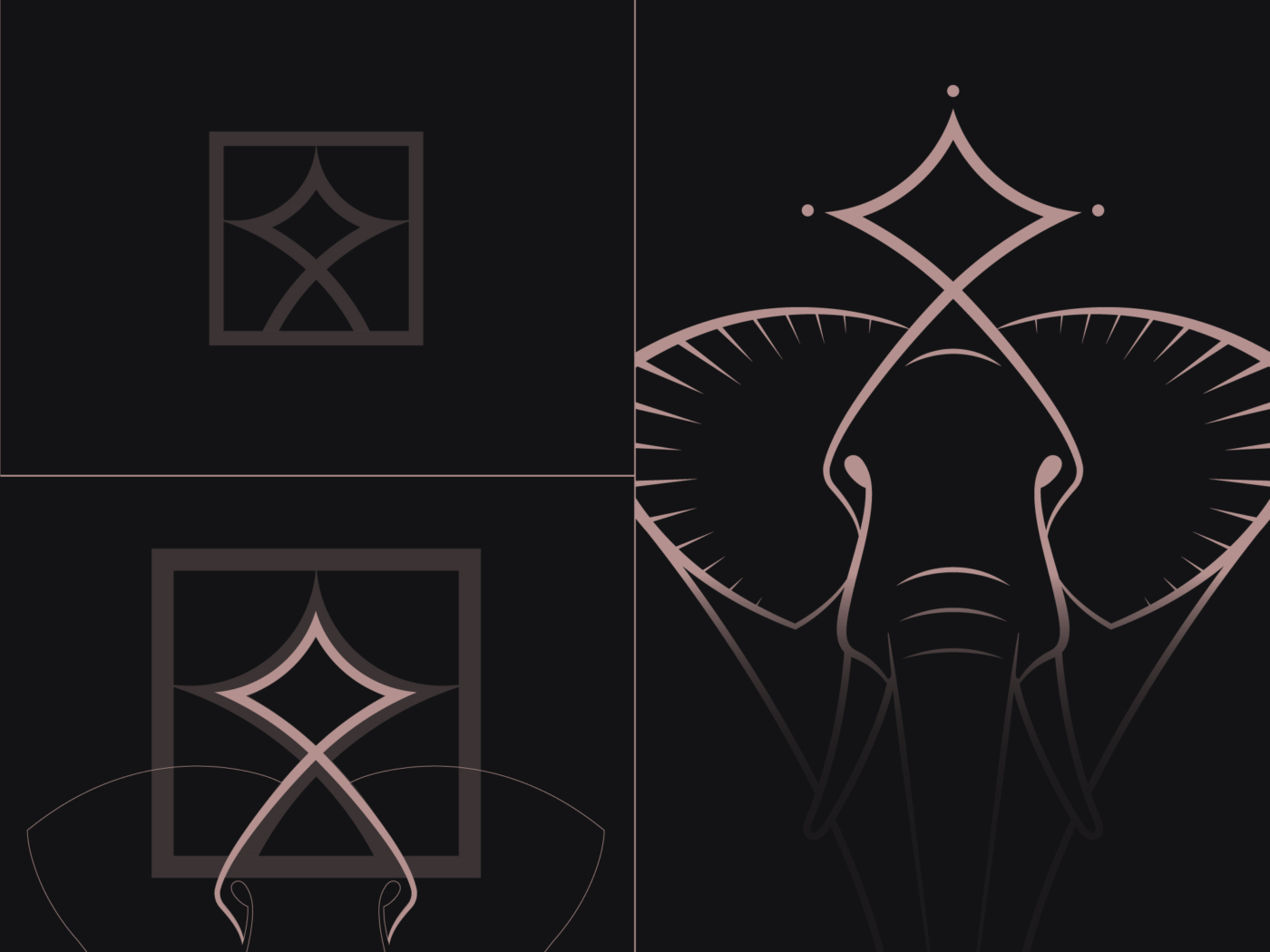
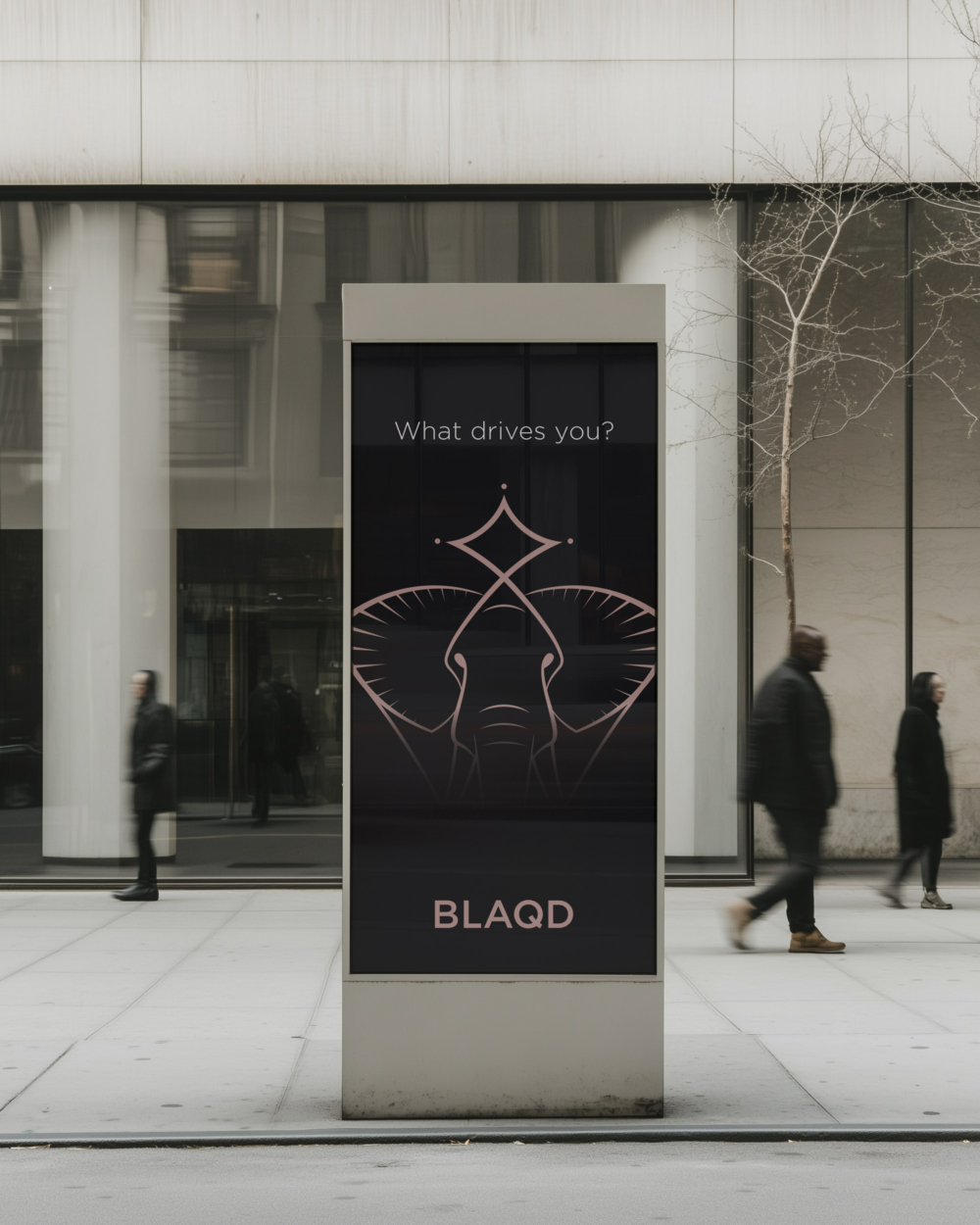
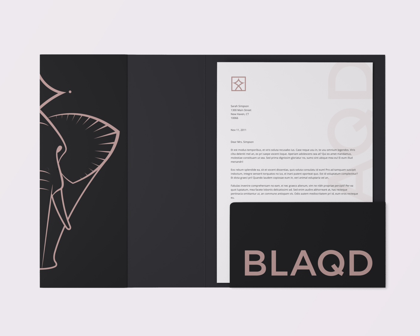
Brand Mascot Illustration
To introduce a more expressive layer to the system, we developed a custom brand illustration: an Art Nouveau–inspired elephant, drawn with stylized curves and tapered lines. The elephant conveys strength, calm, and wisdom—traits that align with BLAQD’s emphasis on safety and assurance. Sitting atop the elephant is a stylized crown—an exact geometric match to the brandmark, ensuring cohesion even in more playful applications.


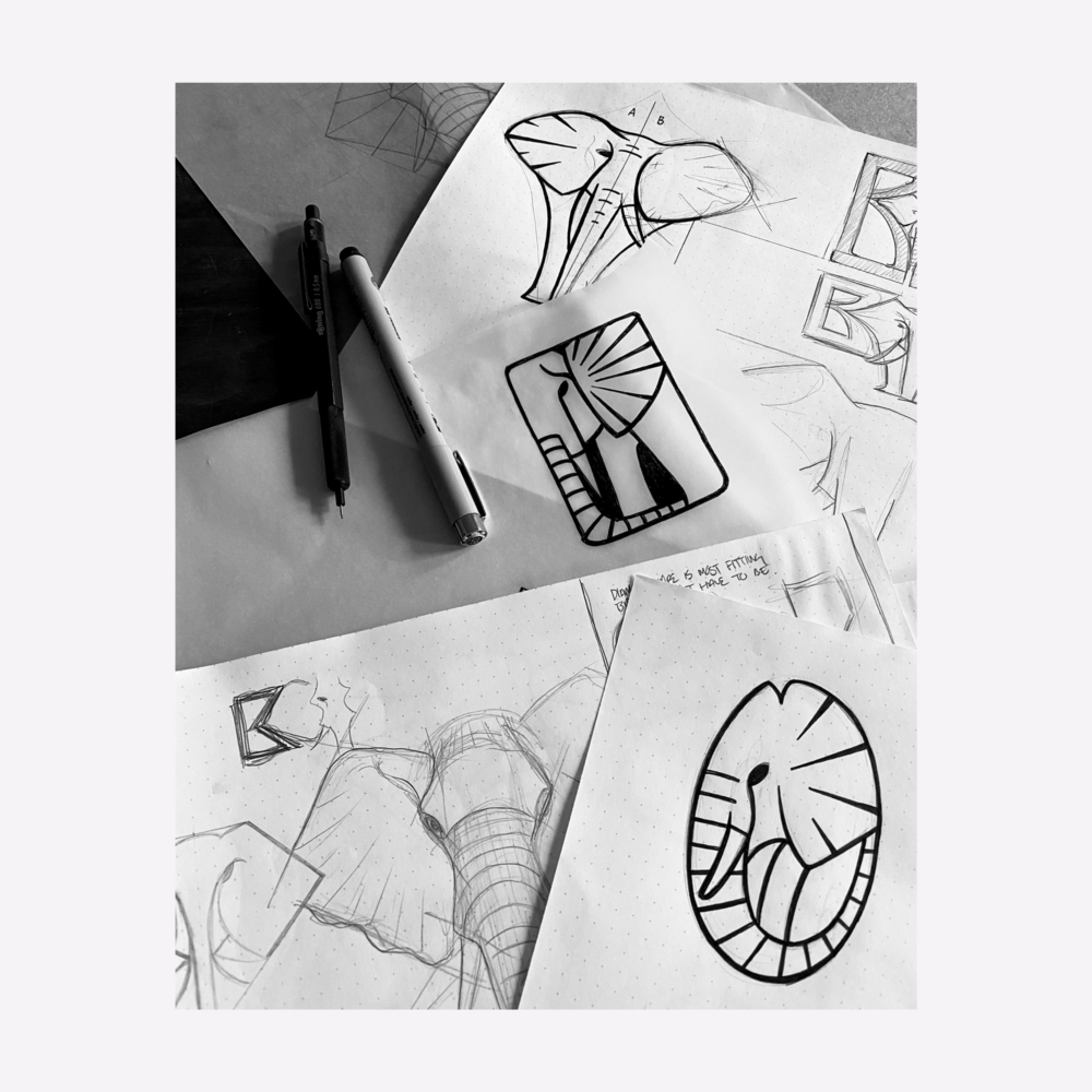
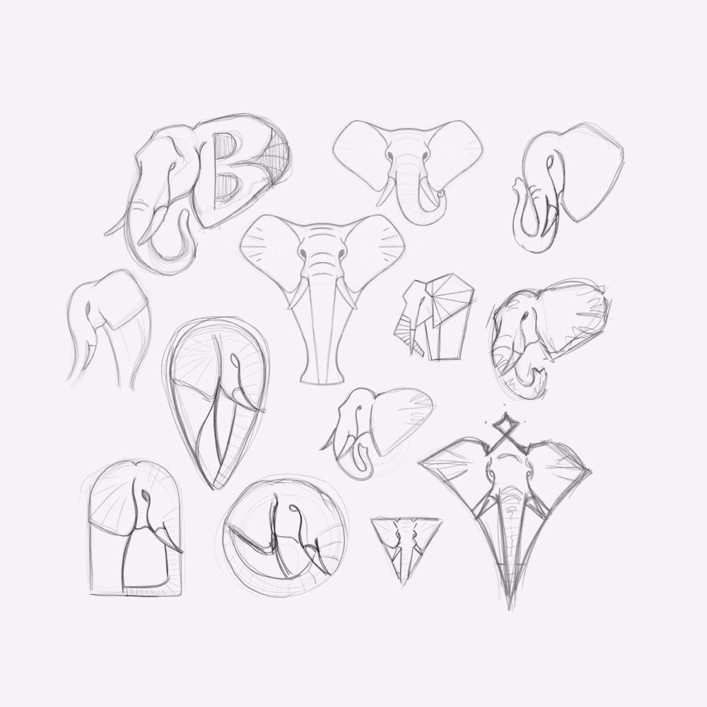
Mascot Process
The final illustration was the result of extensive exploration—hundreds of pencil sketches testing posture, proportion, and personality. Once direction was set, the drawing was redrawn digitally using a precise grid and geometry system to align with the rest of the identity. The process reflects the same balance of structure and expression found throughout the brand.
Visual Cohesion
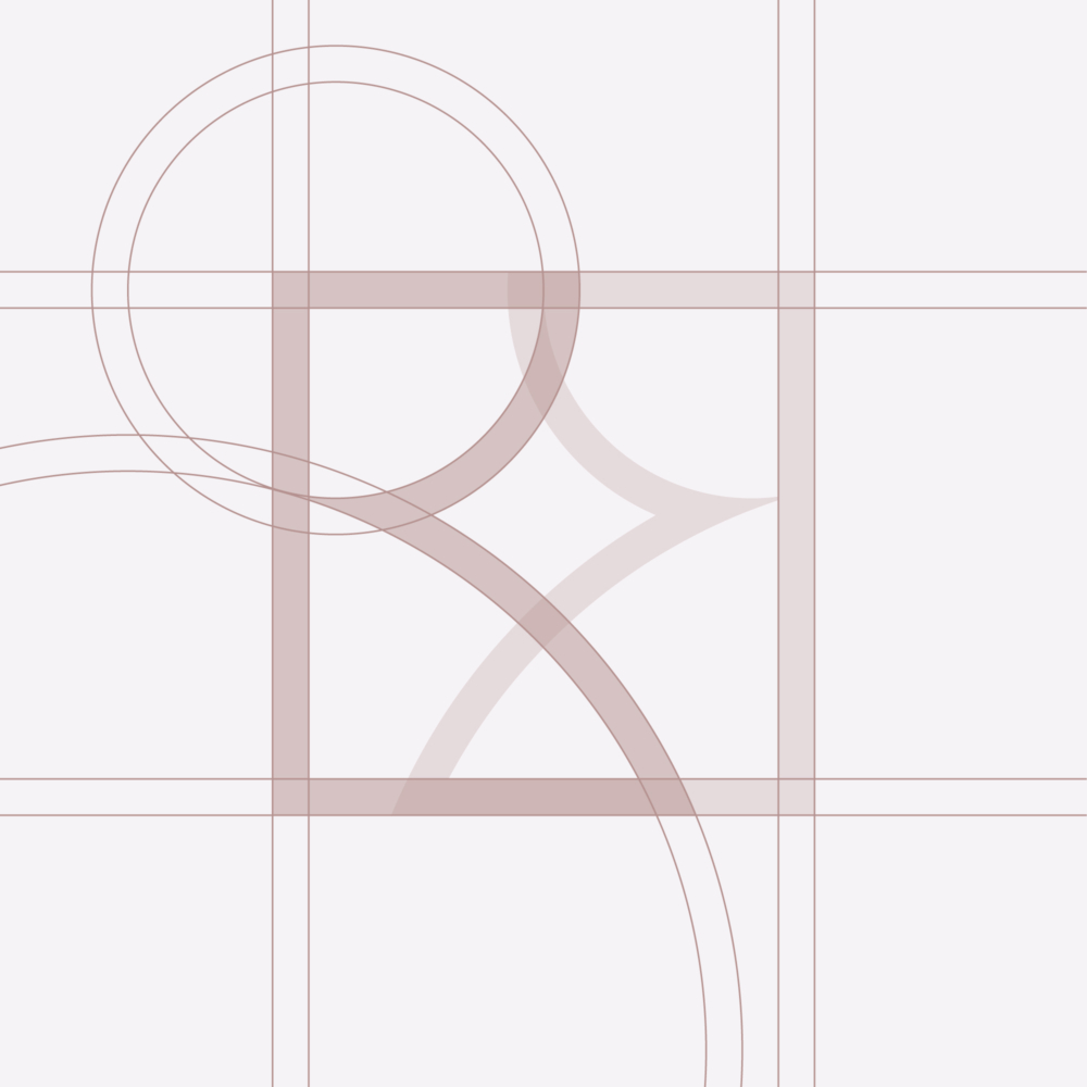
Subtle details create consistency across the identity. The crown atop the brand’s illustrated mascot is a simplified extraction of the brandmark—removing its mirrored B forms while preserving its core geometry. That same arc appears again in the Q’s tail within the wordmark, creating a direct geometric connection between symbol and type. These shared structures tie the system together, giving the brand a visual rhythm that feels intentional and unified.
Brand Typography
The identity uses a structured typographic system built around three typefaces: Gotham, Open Sans, and Source Serif Pro. Gotham handles most display typography and headlines, while Open Sans and Source Serif Pro are used for body copy and small accents. All styles were selected for clarity, accessibility, and tonal alignment with the brand—contemporary, confident, and open.
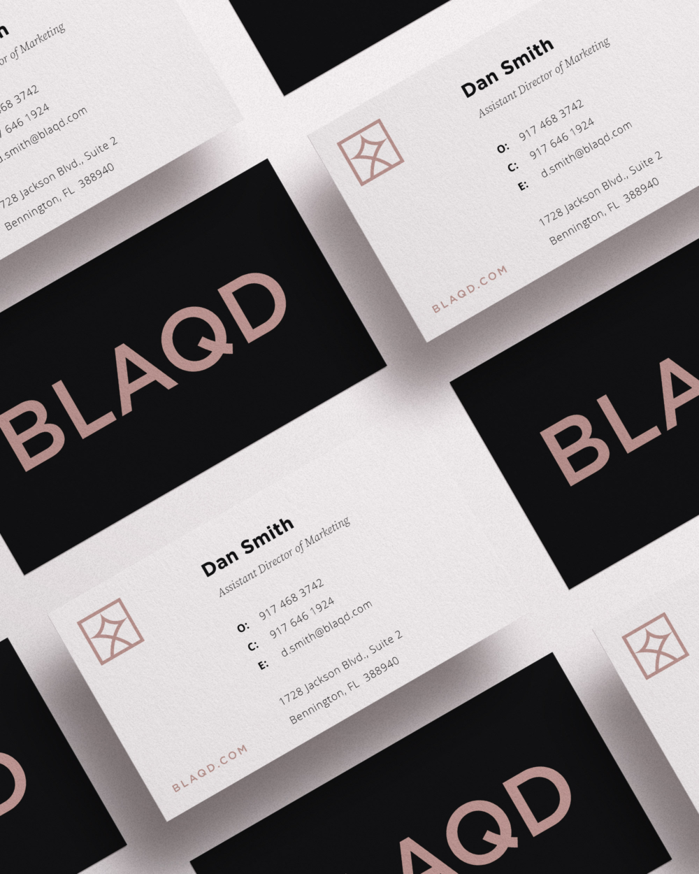
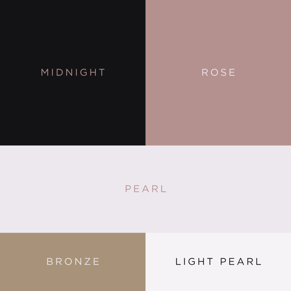
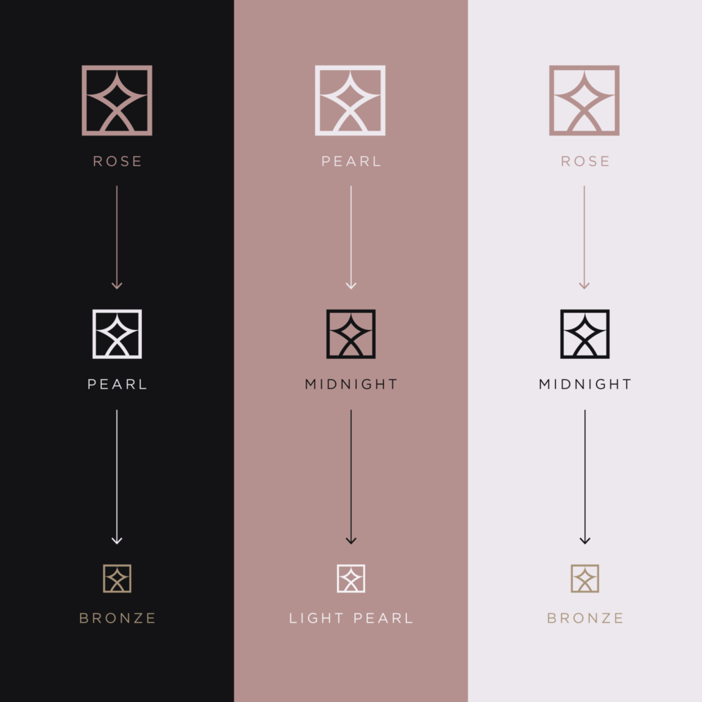
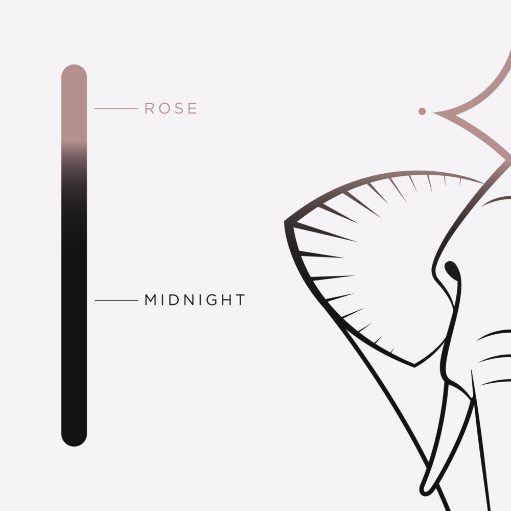
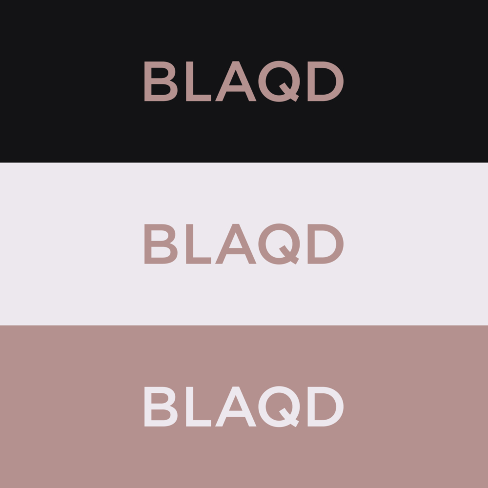
Brand Color
The BLAQD palette is defined by three core colors and supported by alternate tones designed for flexibility and accessibility. Each color was carefully tested for legibility and balance across print and digital formats. The result is a color system that reinforces luxury without excess, and supports a range of layouts from bold to subtle.
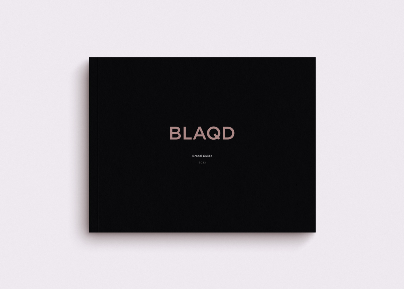
Visual Style Guide
The final brand guide is a 56-page system designed to maintain consistency at every touchpoint. It includes usage rules, logo clearspace, color specifications, typography combinations, icon treatments, application references, and a navigable asset index. Every component was designed on a consistent grid, ensuring clarity and ease of use for both internal teams and external partners.
Wrap Up
The BLAQD identity system brings together elegance, precision, and cohesion to reflect the brand’s unique positioning in the luxury transportation space. From the structural logic of the logos to the expressive energy of the illustration, each component is designed to be clear, connected, and adaptable—just like the service it represents.