
Between
Between is a line of true wireless earbuds that marked Status Audio’s introduction to the next generation of wireless audio. From 2020–2025, I worked with Status to create a distinct yet connected sub-identity to support multiple product launches. The work included a comprehensive visual identity system built to stand apart while remaining tied to the Status brand.
Summary
Between is a sub-brand of Status Audio, created to introduce the company’s entry into the true wireless earbuds category. Building on an ongoing design partnership with Status that began in 2015, I worked closely with the team to define the visual identity, packaging system, and web presence for the Between line—ensuring visual continuity with the parent brand while establishing a distinct identity.
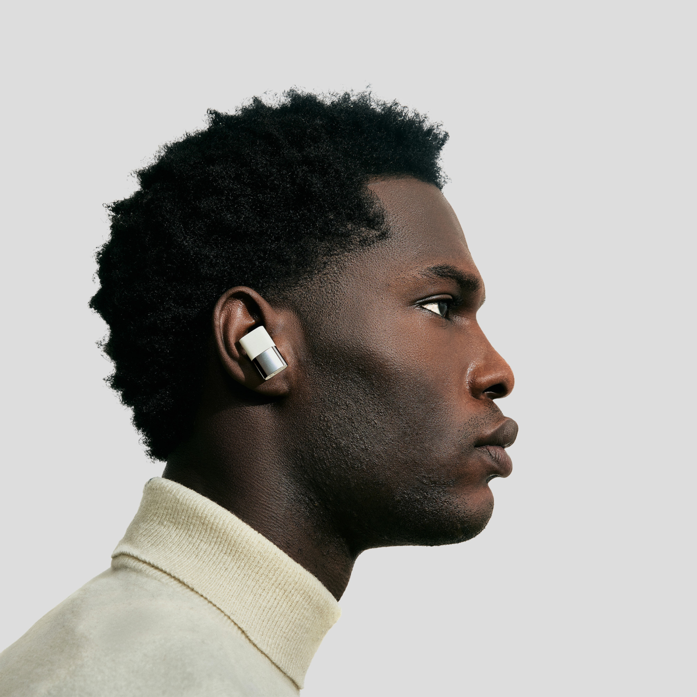
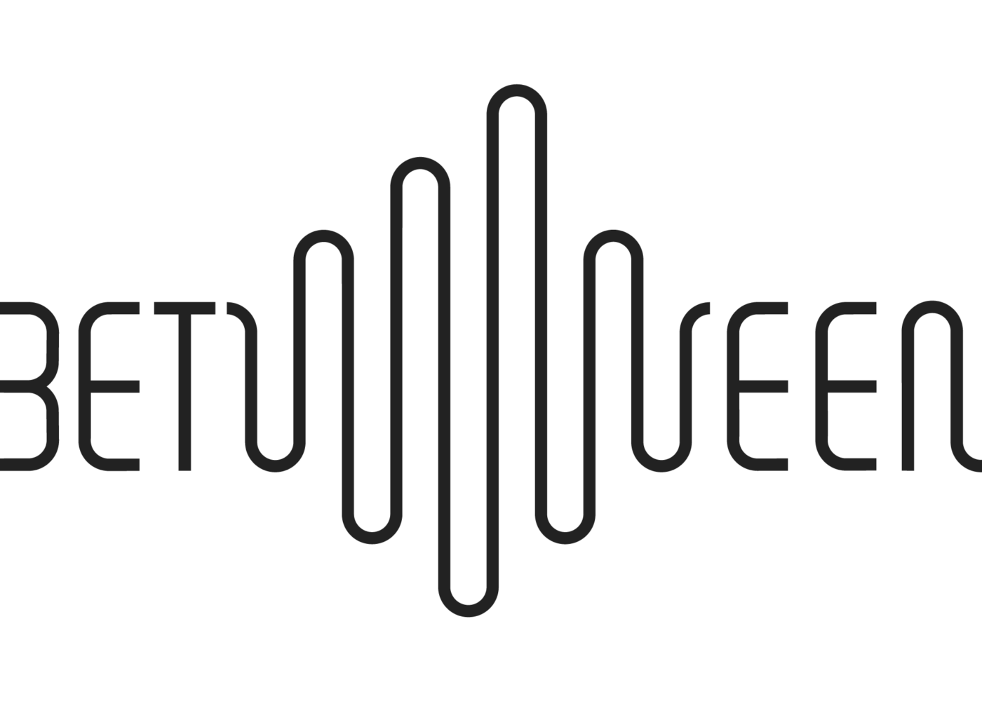
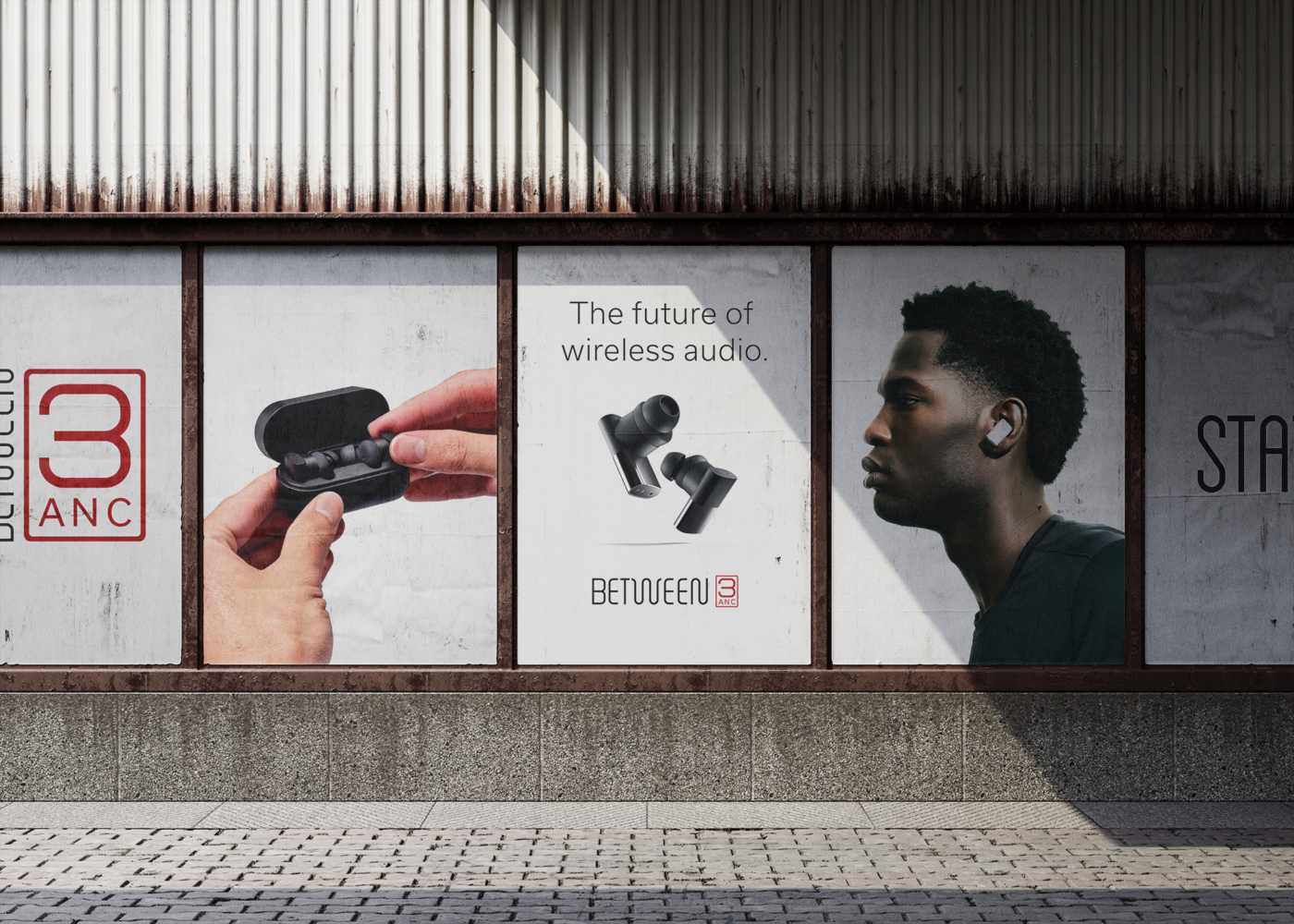
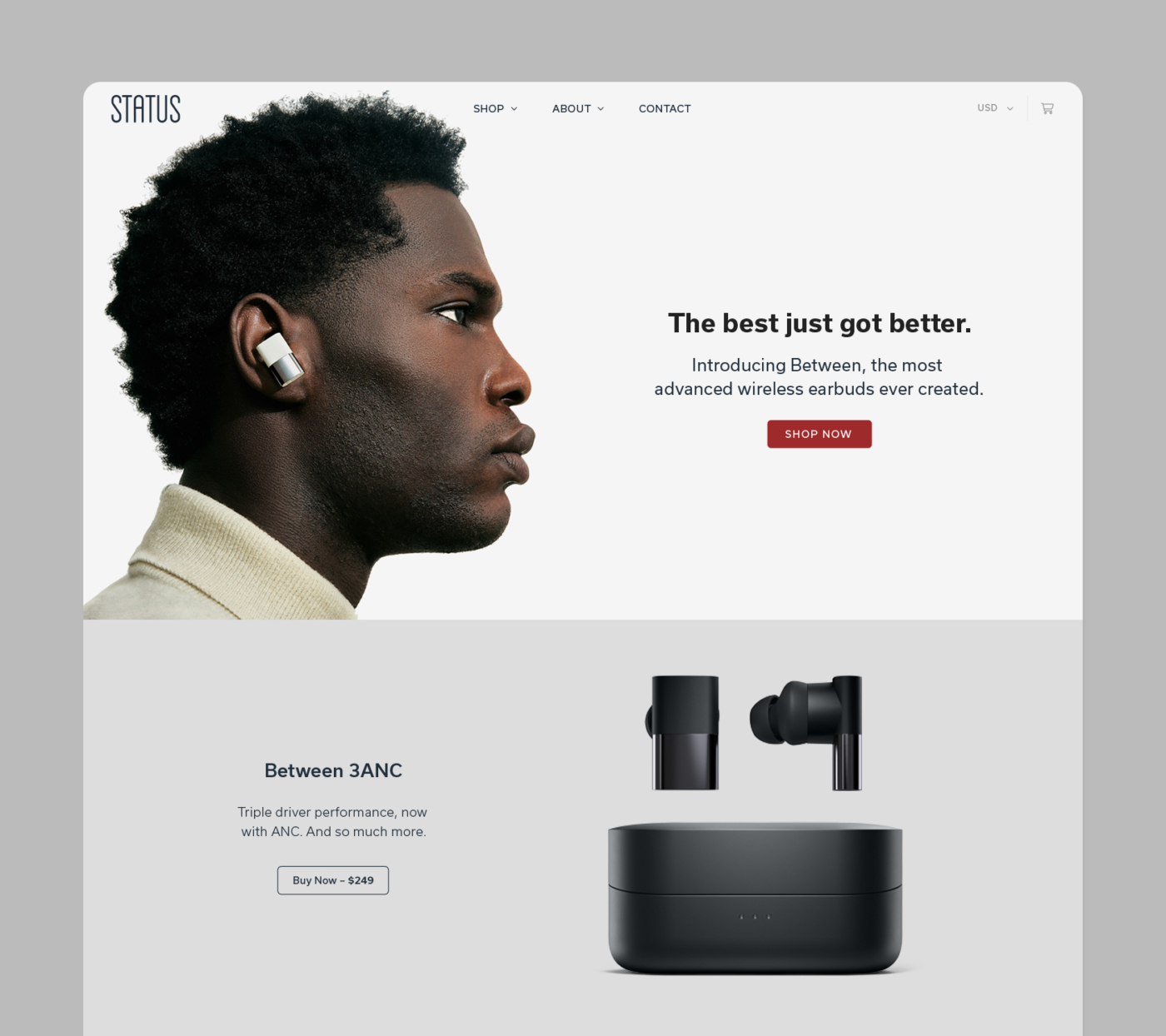
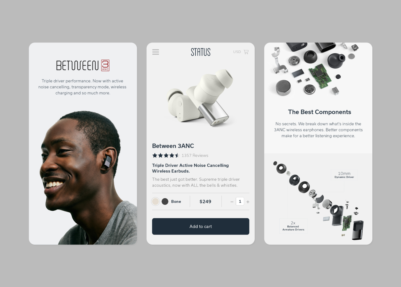
The first product, Between Pro, launched in 2020. It marked a significant shift in the company’s product offering and required a visual system that reflected its technological step forward. After exploring different relationships between the existing Status logo and the new line, we landed on a standalone wordmark for Between—one that shared visual DNA with the Status identity but could function independently across packaging, UI, and marketing. The Between logotype was designed using the same soundwave-inspired geometry as the Status mark. A key visual feature is the centered W, which mimics the shape of a waveform and subtly references the name by linking left and right—like earbuds in use.
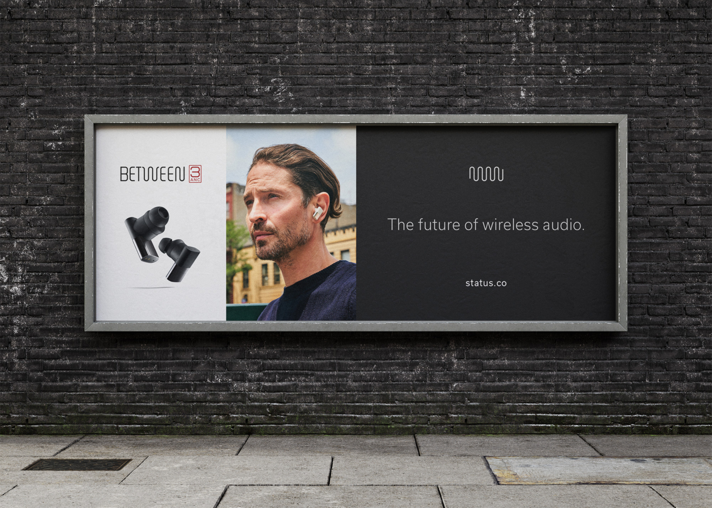
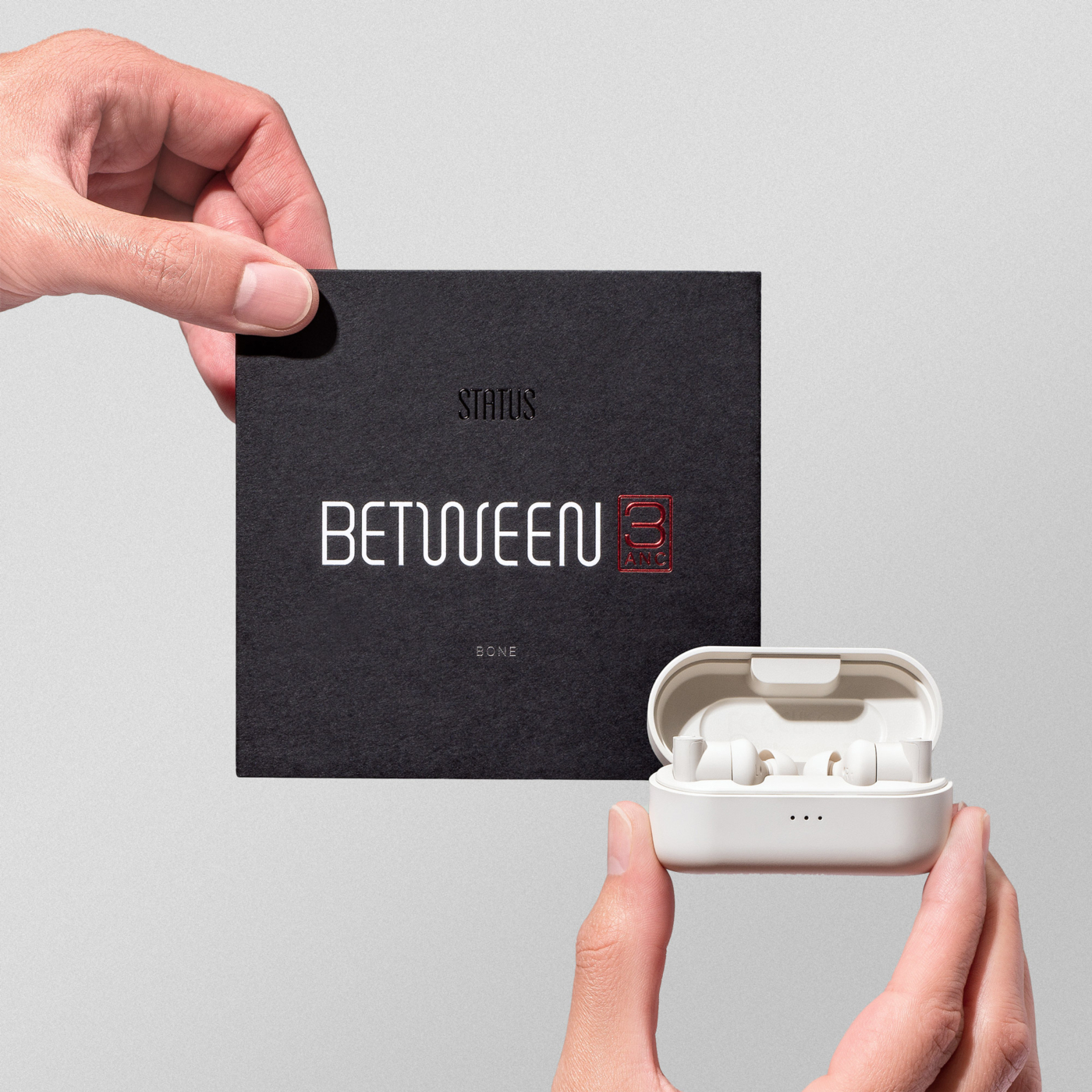
To complement the new wordmark, I reorganized the existing Status color palette—bringing neutral tones to the foreground while reserving the original blues for accent. This allowed for a differentiated look without diverging from the brand’s established sensibility. When the second product, Between 3ANC, launched in 2022, I extended the identity with a new logo variant featuring a boxed-in red “3ANC” lock-up. This addition helped visually separate the two products while introducing a bold new tone to the color system.
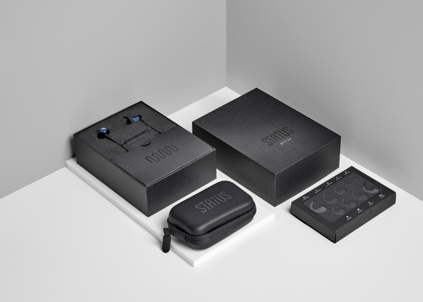
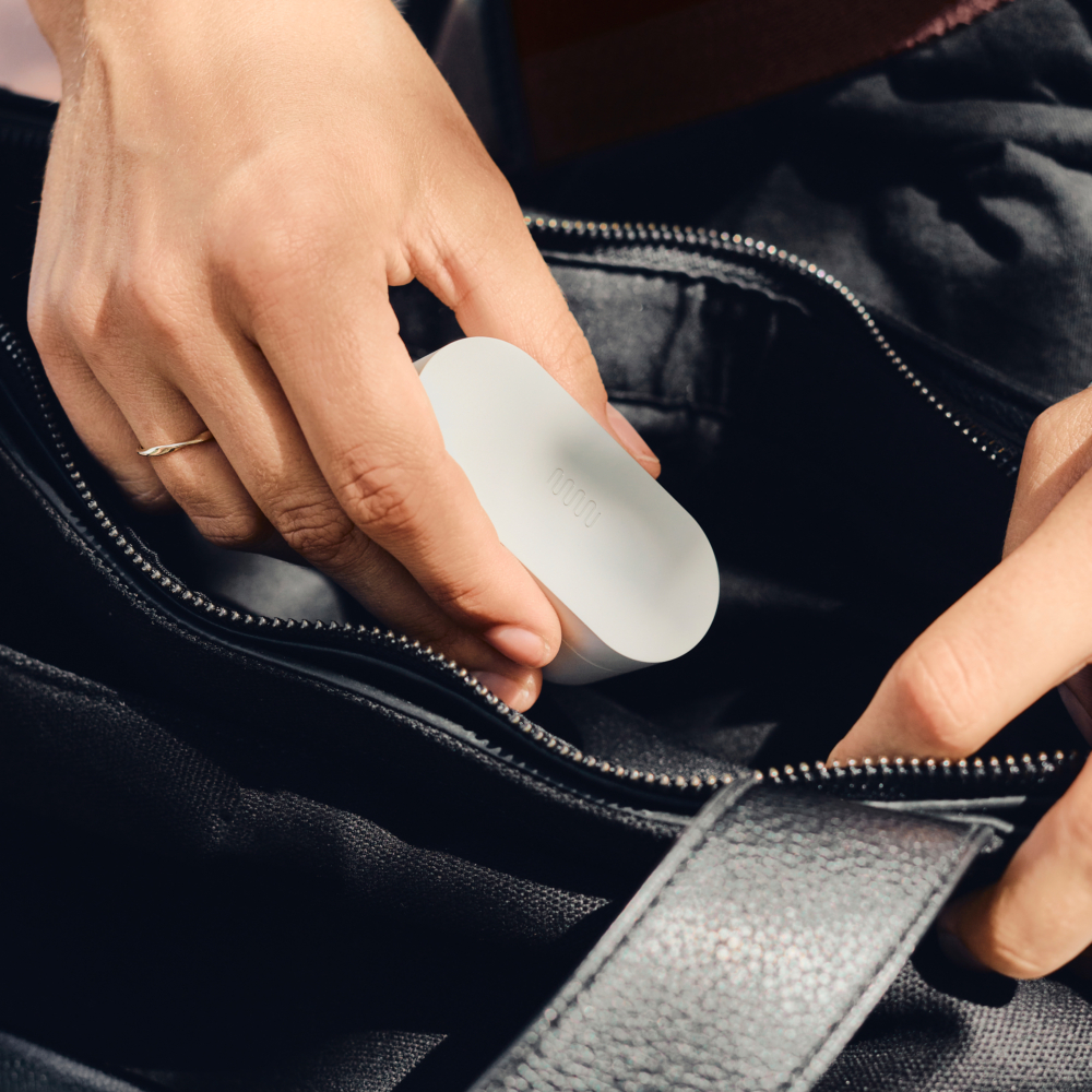
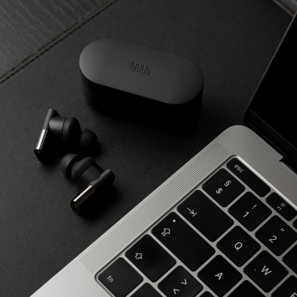
Packaging followed a modular structure based on the system developed for Status products. While much of the form factor remained consistent, graphics and layouts were adapted to fit the unique proportions and brand language of the Between line. Internal and external assets were designed to reflect the new sub-brand while maintaining the same level of production clarity.
Web updates were made in parallel with product development. New banners, layouts, and conversion-focused content blocks were integrated into the Status Shopify theme—enabling a seamless browsing experience while highlighting the differences and advancements in the Between line.
The Between identity was designed to grow within the Status ecosystem, providing a clear visual signal for the brand’s evolution into wireless audio. While the product line remains focused on the existing models, the identity system continues to serve as a cohesive, standalone extension of the Status Audio brand.
Related Projects:
Status Audio (2015–Present)
Status Pro X (2025)
Project Details
- Client
- Status Audio
- James Bertuzzi
- Location
- New York
- USA
- Industry
- DTC
- Headphones
- Project Term
- 2020–2025
- Industrial Design
- Photography
- Status Audio
- Status Pro X (Coming Soon)
- Status Hub App (Coming Soon)
- Voiceloom (Coming Soon)
The Logos & Identity
Between needed a distinct identity that could stand on its own while remaining connected to the Status Audio brand. The result is a custom wordmark and graphic system that shares core characteristics with the original Status identity—drawing from the same soundwave-inspired geometry—but with structural and tonal differences that reflect the new product line’s unique role.

Logo Anatomy
The Between wordmark was drawn using the same soundwave logic as the Status logo. The centered W echoes the shape of a waveform and creates a visual connection between left and right—symbolizing the name itself. The result is a standalone mark that feels both new and familiar.
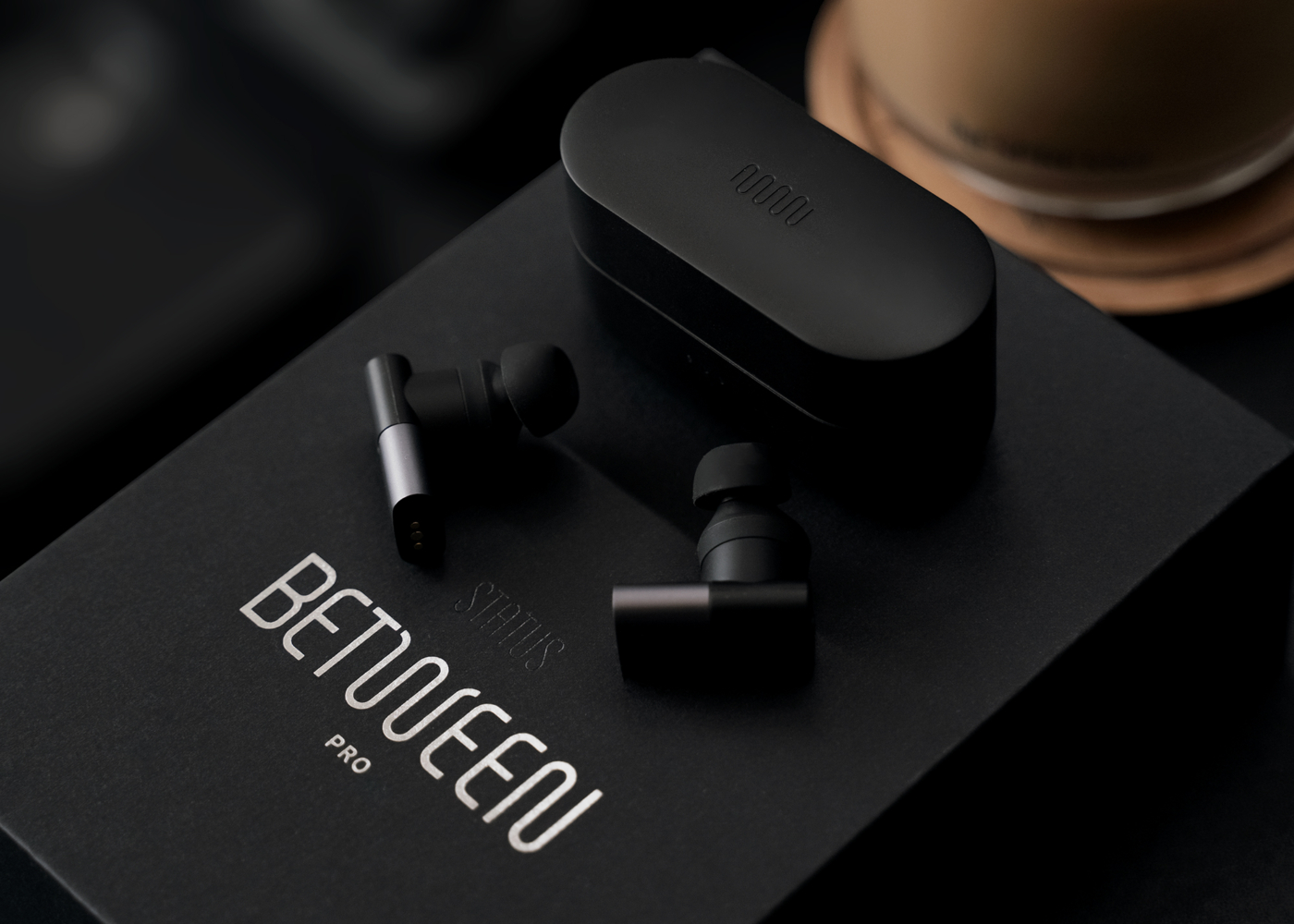
Packaging
Between’s packaging system builds on the modular structure developed for Status, adapted to reflect the sub-brand’s distinct proportions and tone. While key elements—like the internal layout and materials—remain consistent, the graphics and color treatment reflect Between’s identity and its position as a next-generation product line.
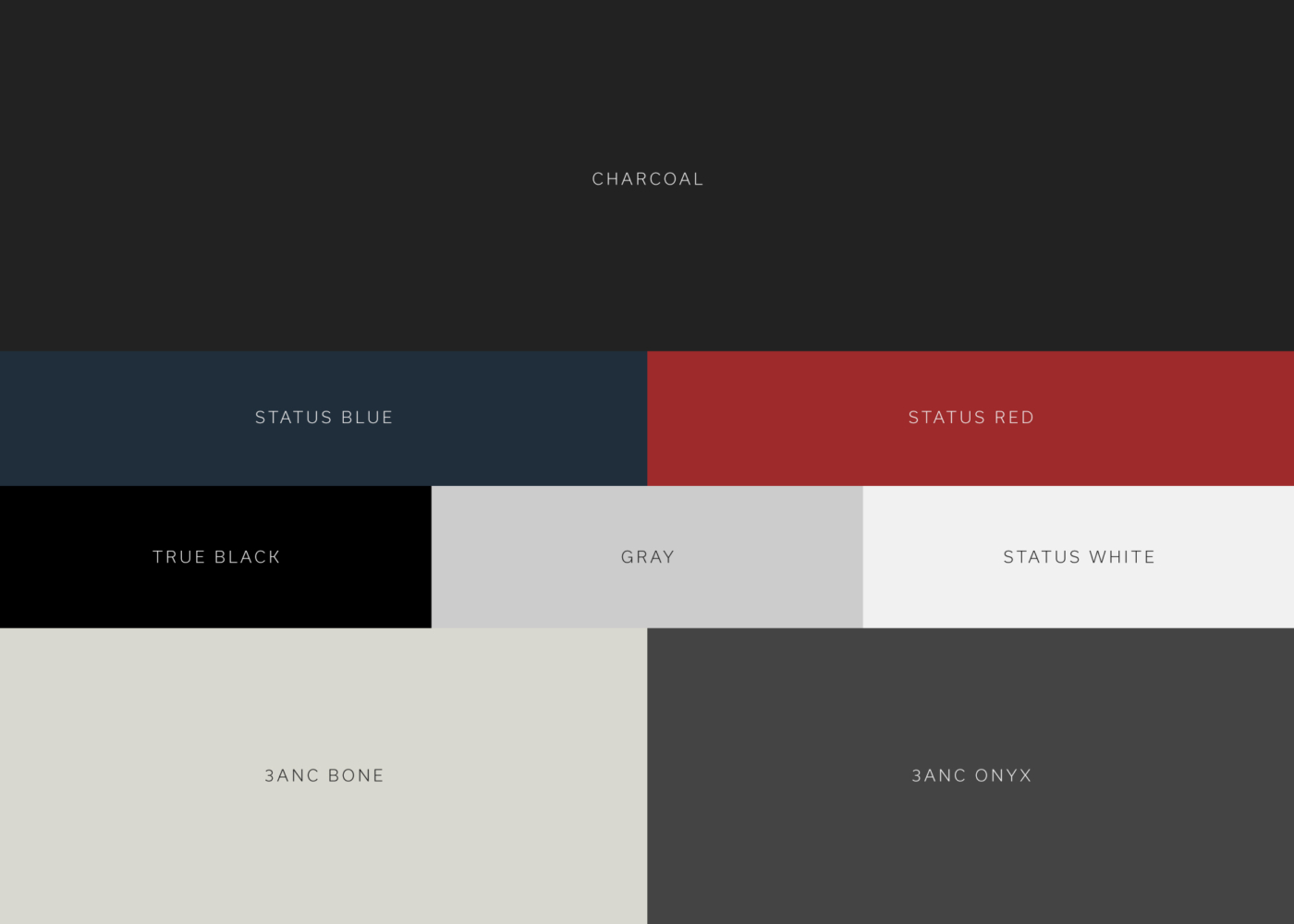
Brand Color
Between’s palette reorganizes the Status color system—elevating dark neutrals and Status Red while introducing new colors that correspond to product variants. This shift in emphasis helped signal the new line’s character while maintaining visual continuity.

The Website
Updates to the Status Audio website supported the Between product launches with new homepage banners, product page layouts, and improved purchasing flows. The fully custom Shopify theme adapts easily to new releases, allowing the Between line to be showcased without disrupting the existing brand architecture. View the Status case study for more.
The Between identity was designed to feel like a natural extension of the Status Audio brand—visually aligned, but distinct enough to mark a new chapter in product evolution. Through subtle shifts in type, color, and layout, the system helped define a sub-brand that supported the launch of Status’ most advanced products to date.