Status Audio
Status Audio makes high-quality, minimalist audio products built around sound performance, premium materials, and thoughtful design. Since 2015, I’ve worked with Status across nearly every aspect of their visual and digital identity—including logo design, packaging systems, product ID, websites, and more. Over the years, we’ve helped shape a brand aesthetic that remains laser-focused on substance and simplicity, while scaling to support a growing lineup of products and platforms.
Project History
Status Audio makes high-quality, minimalist audio products built around sound performance, premium materials, and thoughtful design. From 2015 to the present, I’ve worked with Status to shape nearly every aspect of the brand’s visual and digital presence—from the original online store and product ID concept to evolving visual identity systems, packaging, websites, and mobile UI.
The collaboration began in 2015, when founder James Bertuzzi approached me to design a new Shopify store for their first product: a cabled headphone called the HD One. At the time, the brand’s position—“No Logos. No Celebrities. Just Sound.”—stood in direct contrast to the celebrity-endorsed, heavily branded audio gear dominating the market. Our work reflected that distinction. The new site prioritized usability, minimalism, and clarity, using clean grids, muted color, and sparse visual noise to echo the product philosophy. The launch helped establish a strong design foundation and significantly improved traffic and conversion.
From there, the brand and its visual system evolved. A new logo was designed—anchored by a custom wordmark with letterforms inspired by the oscillating flow of a soundwave. That pattern was later abstracted into a simplified brandmark and also used as a flexible design element across packaging, typography, and marketing materials. Early on, we introduced a product ID concept: a subtle typographic code laser-etched into each product and its packaging. These identifiers served as the only visible “branding” on early Status products and helped define the brand’s minimalist approach.
As the product line expanded to include wireless models, earbuds, and accessories, we continued to evolve the visual identity, introduce new color systems, and design a universal packaging system that could be reliably produced at multiple overseas factories. Each component—from printed sleeves to interior graphics—was developed to ensure a consistent and minimal unboxing experience regardless of product or manufacturer.
We’ve redesigned the Status website multiple times to reflect changes in technology, product lineup, and customer behavior. The most recent Shopify builds feature dynamic content blocks that allow the Status team to easily update product storytelling, imagery, and features without touching code. Each iteration has carried forward the core brand principles while improving performance across devices—especially mobile, where most users now interact with the brand.
In addition to identity, packaging, and web, I’ve helped design Status’ mobile app, developed custom UI elements for feature launches, and collaborated on countless product graphics. The brand’s visual language has been featured in leading design and tech outlets, and was recognized with an A’Design Award for Advertising, Marketing, and Communication.
Over nearly a decade, Status has grown from a single-product startup to a leading direct-to-consumer audio brand. Our long-term collaboration has ensured that the brand’s design integrity has scaled alongside its reach—maintaining a clear, consistent, and deliberately understated visual identity.
Related Projects:
Between by Status (2020–2025)
Status Pro X (2025)
Project Details
- Client
- Status Audio
- James Bertuzzi
- Location
- New York
- USA
- Industry
- DTC E-Commerce
- Consumer Electronics
- Personal Audio
- Project Term
- 2015–Present
- Industrial Design
- Photography
- Site Inspire
- Mindsparkle Mag
- Minimalissimo
- A’Design Awards
- Awwwards
- Design Ideas
Visual Identity
The Status visual identity is built on restraint. From the logotype to the product packaging, every decision favors clarity, neutrality, and longevity. The system includes a core wordmark, a recurring soundwave pattern, secondary brandmarks, product ID treatments, and a minimal palette, all carefully developed to support a no-nonsense, audio-first philosophy.
The Logo
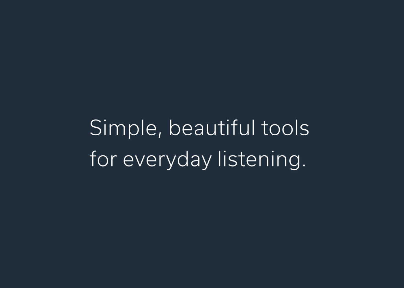
The Status wordmark features custom letterforms shaped by a simple soundwave pattern. Its proportions give it balance and clarity across media, while its curves reflect the brand’s focus on control and fidelity.
 Derek Elliott
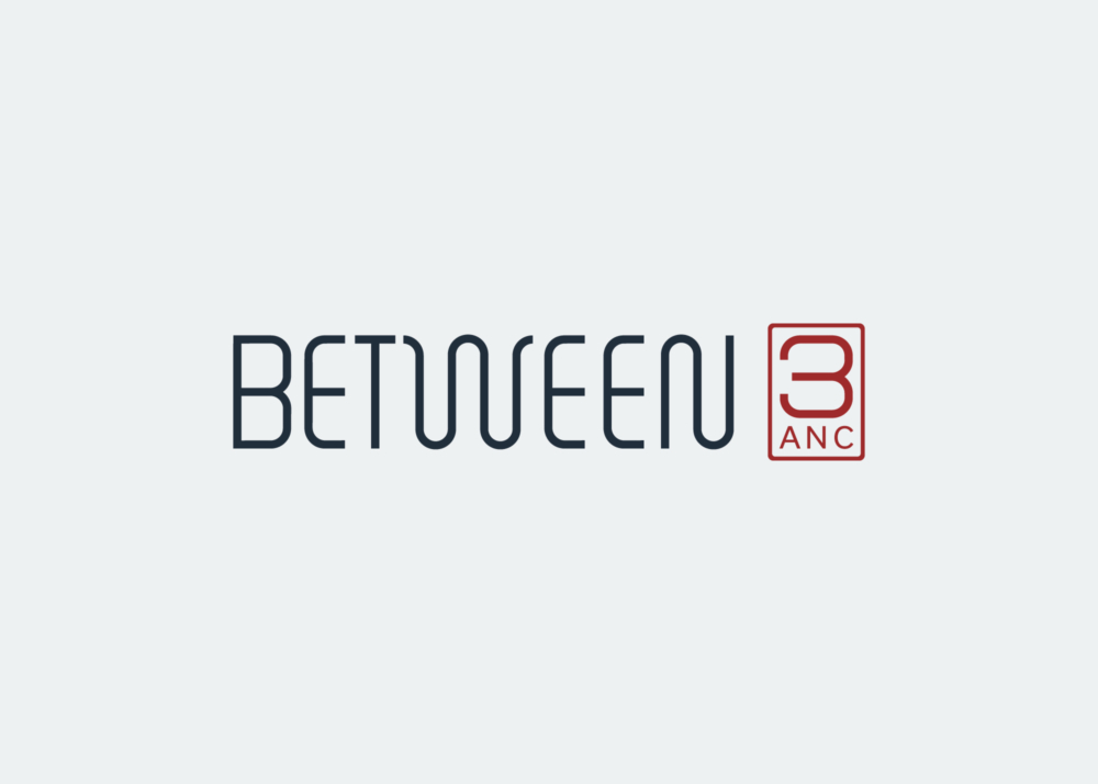
Secondary Brandmark
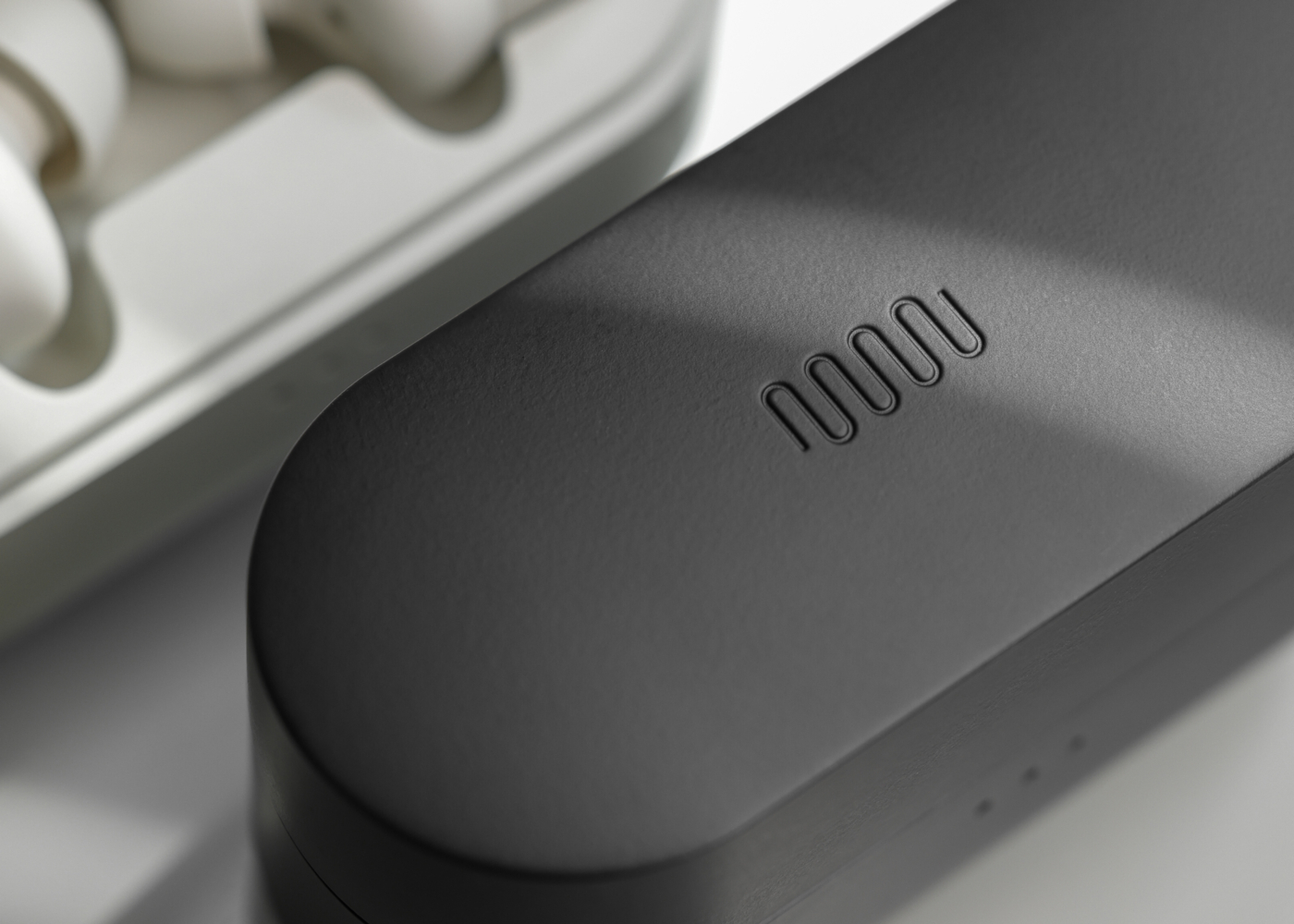
The wave pattern that inspired the wordmark has evolved into a foundational graphic element. It’s used subtly on packaging, etched into charging cases, or placed discreetly on collateral.


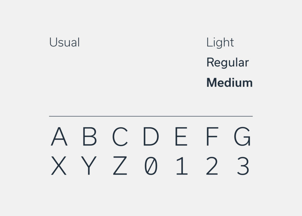
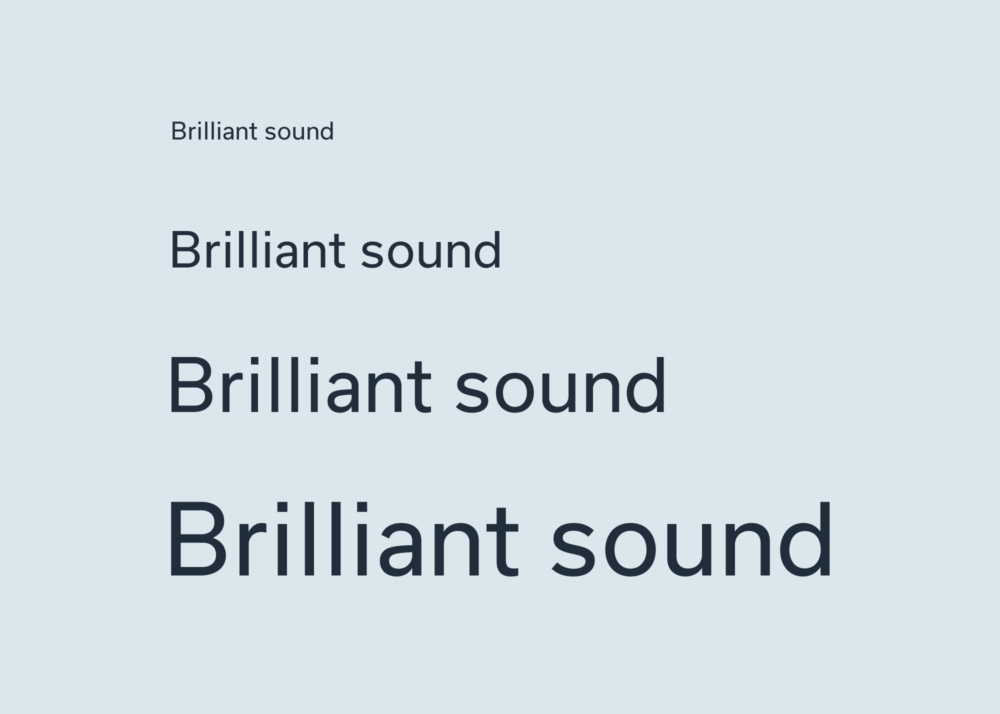
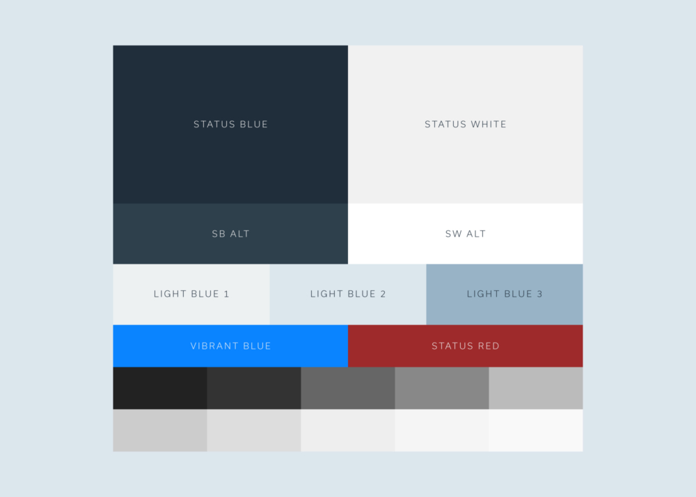
Typography & Brand Color
A modern sans-serif typeface reinforces the brand’s technical, low-noise aesthetic. The color palette emphasizes neutral tones that support the product’s visual simplicity.

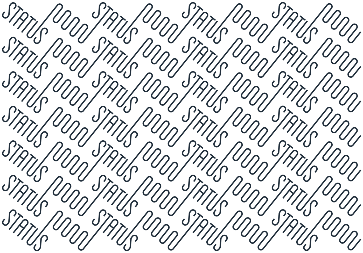
Custom Letterforms
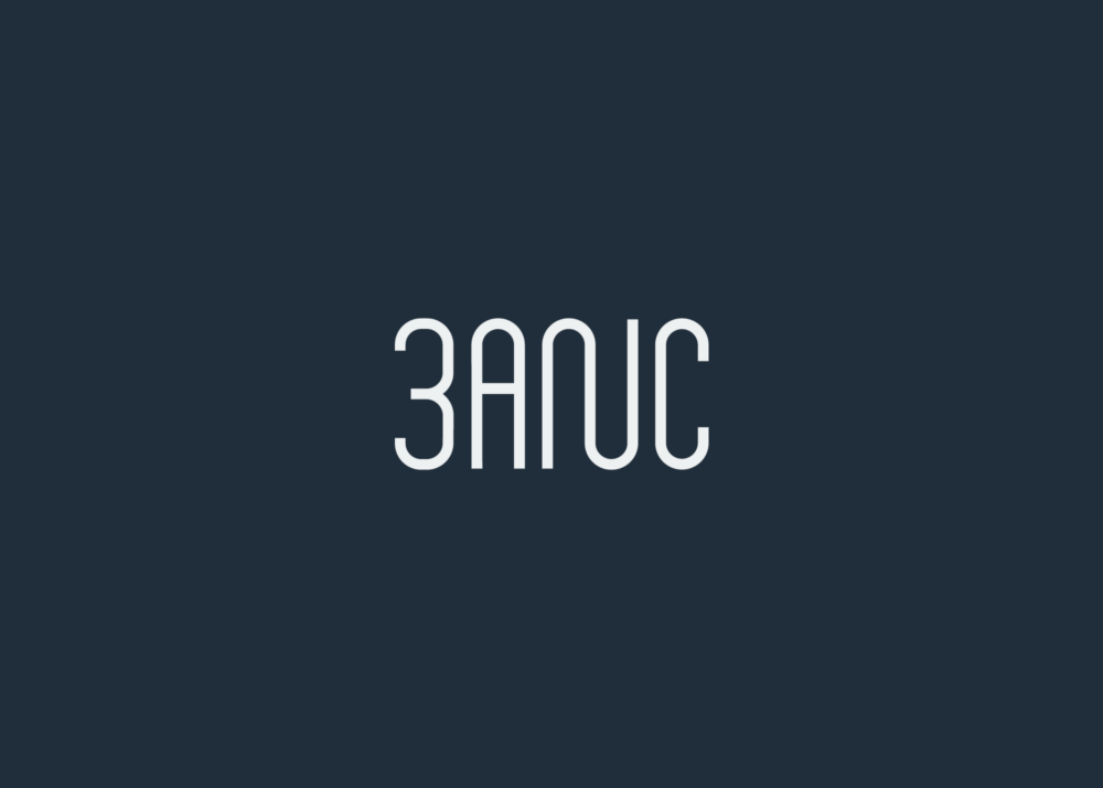
The wave pattern that inspired the core logo is often used as a guide for creating new letterforms, including entire wordmarks for new product lines.
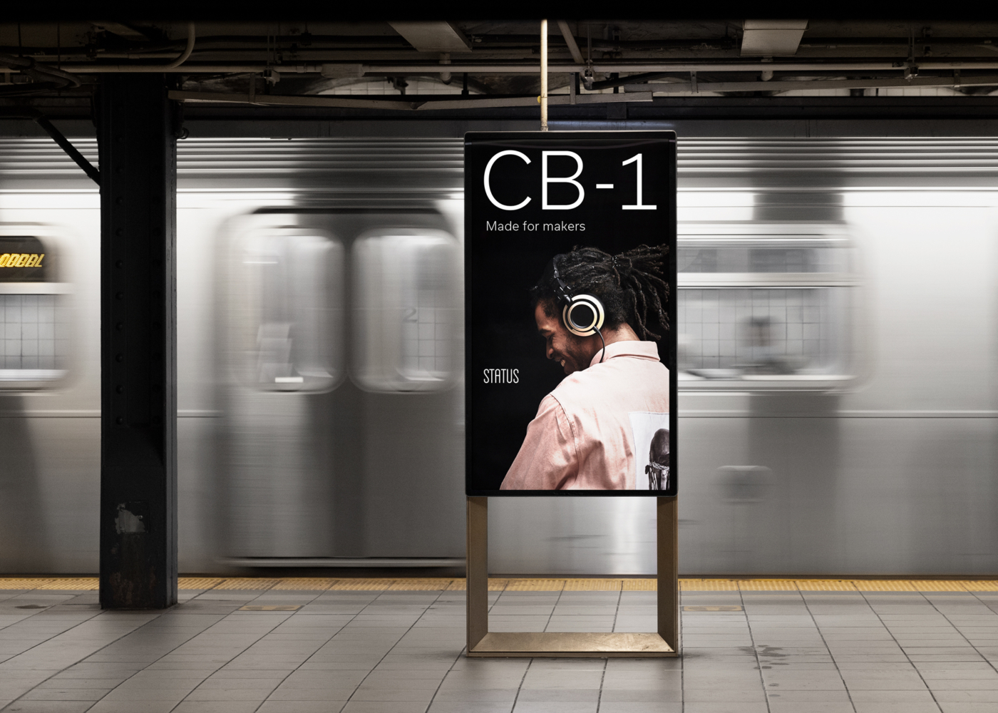
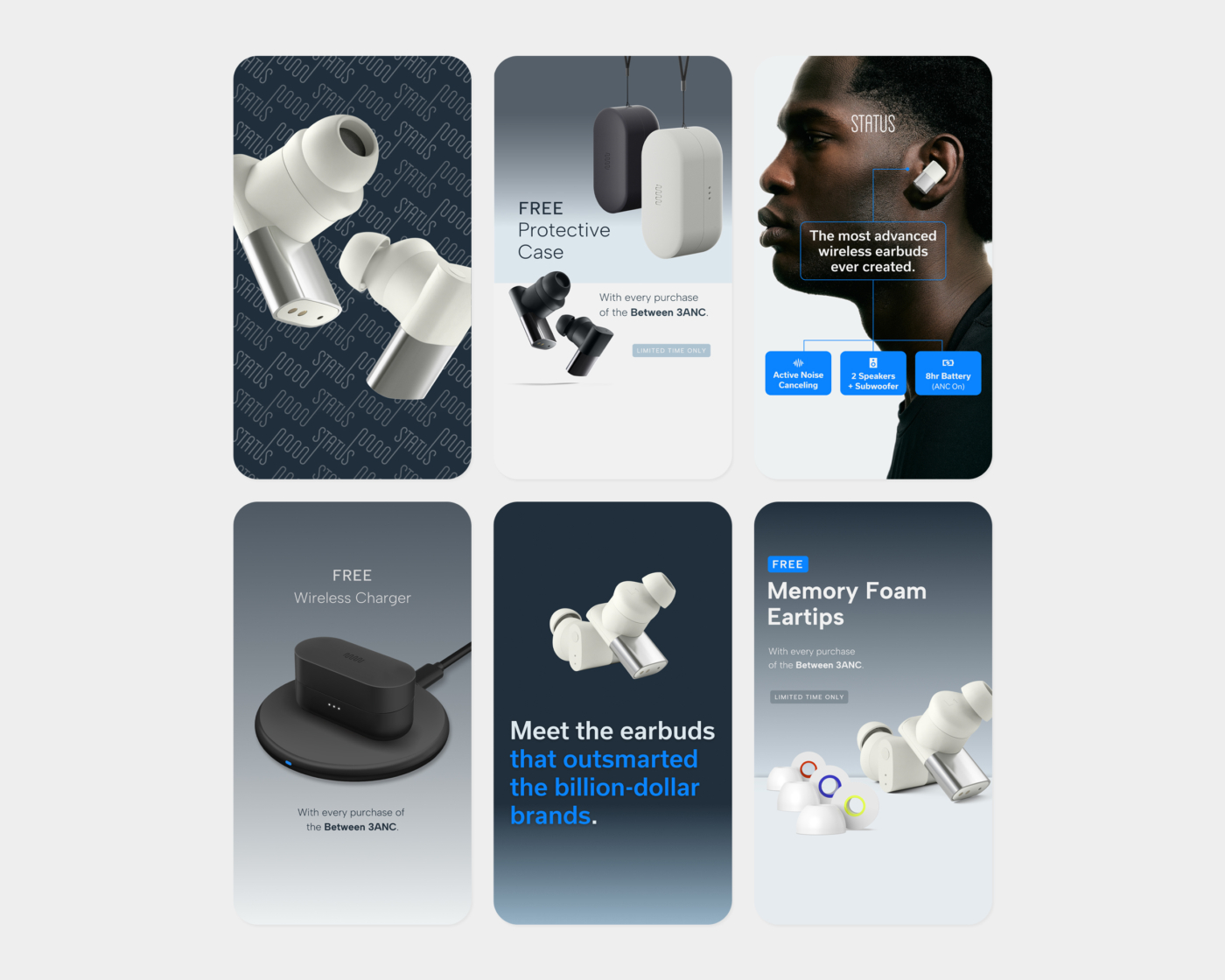
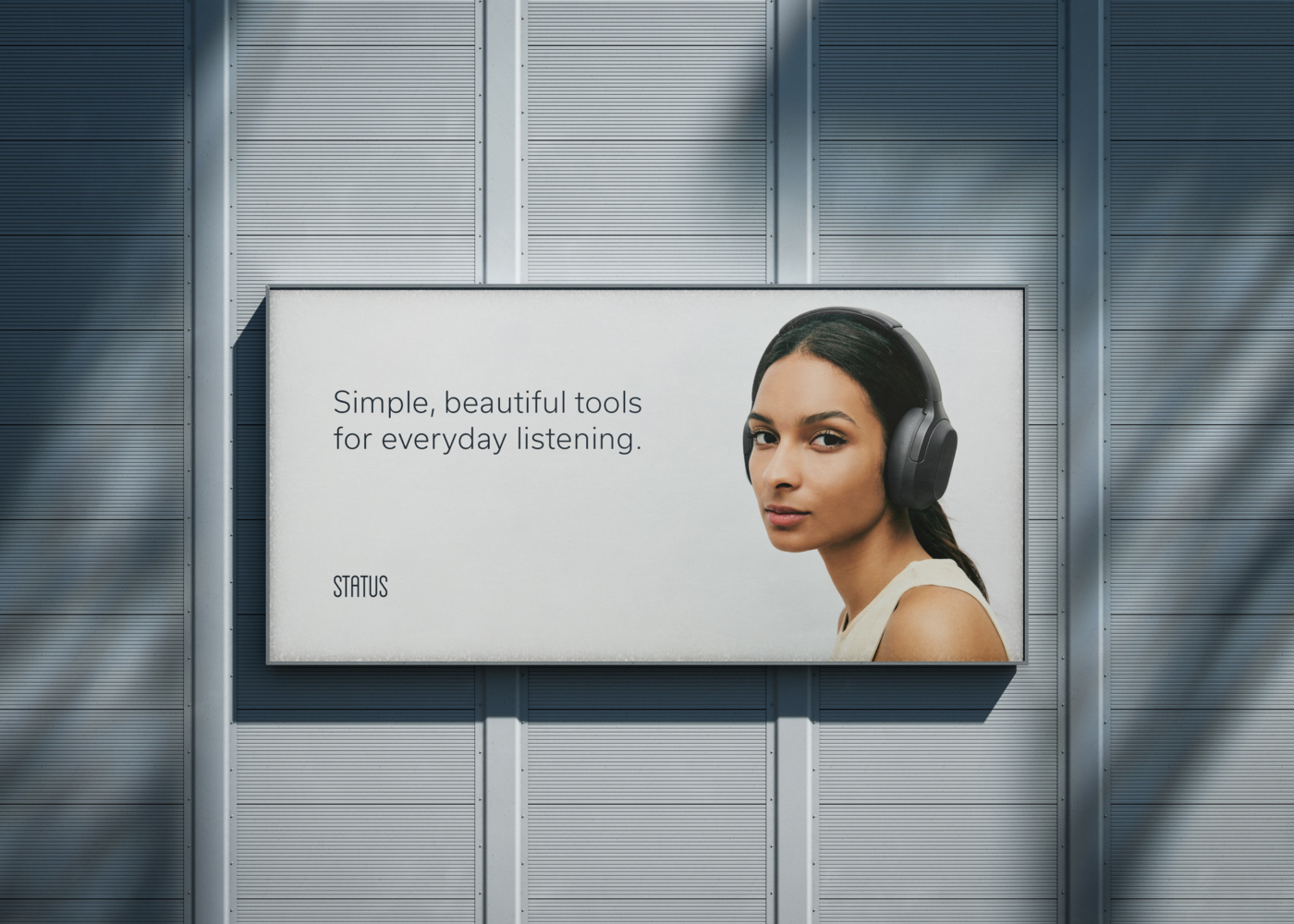
Marketing & Paid Social
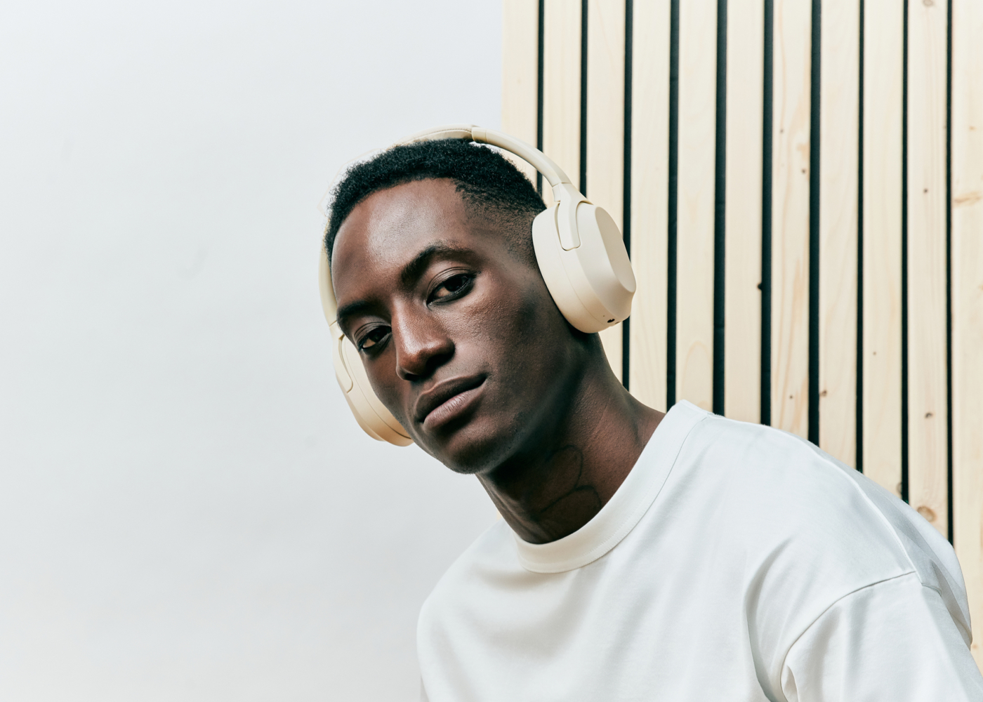
Numerous sets of paid social ads have been created on an ongoing basis to promote Status products and related accessories. Working from founder-supplied messaging, we explored a wide range of visual treatments to highlight product features, promotions, and key differentiators. Shown here is a small sampling from a much larger body of work promoting Status products.
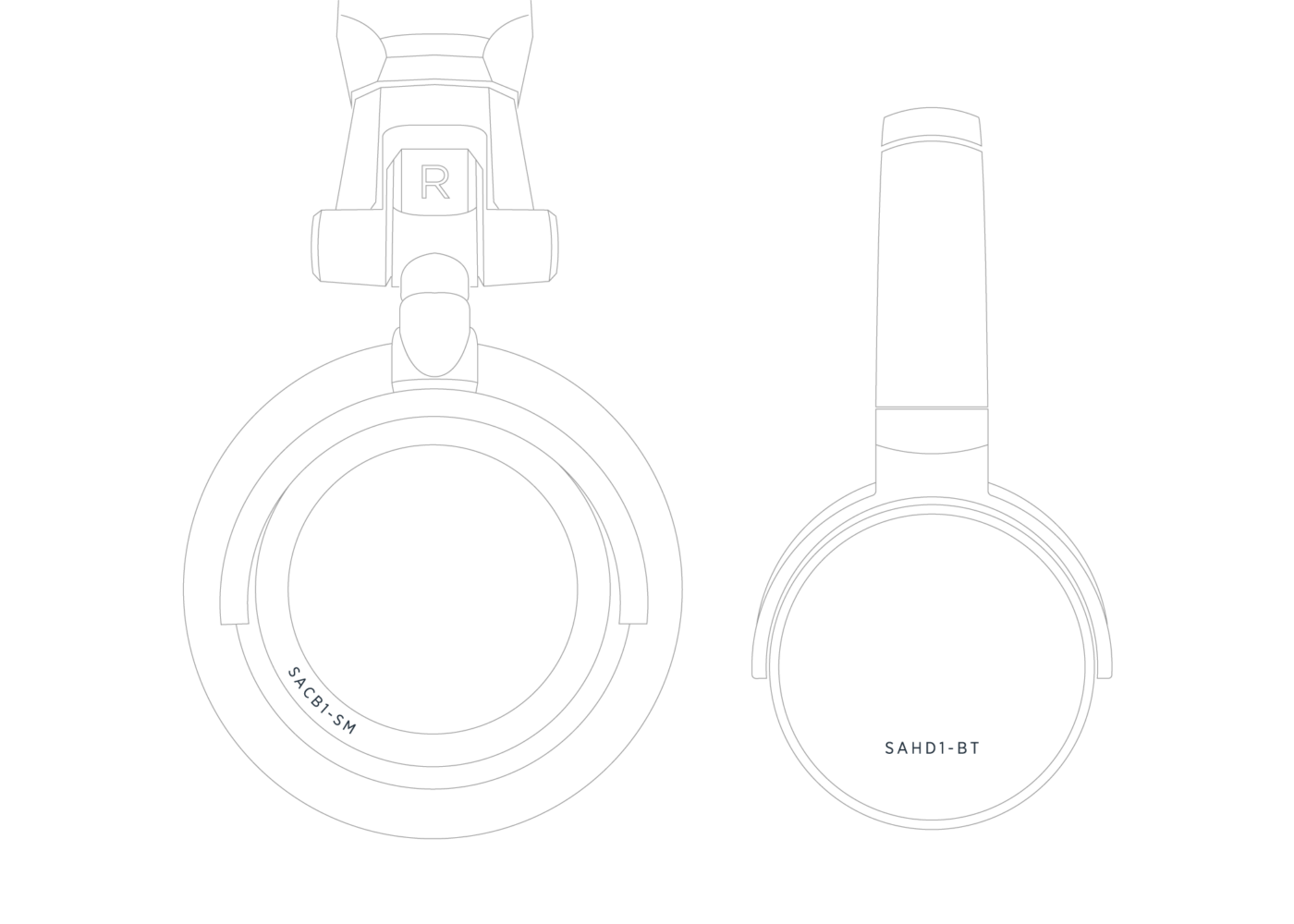
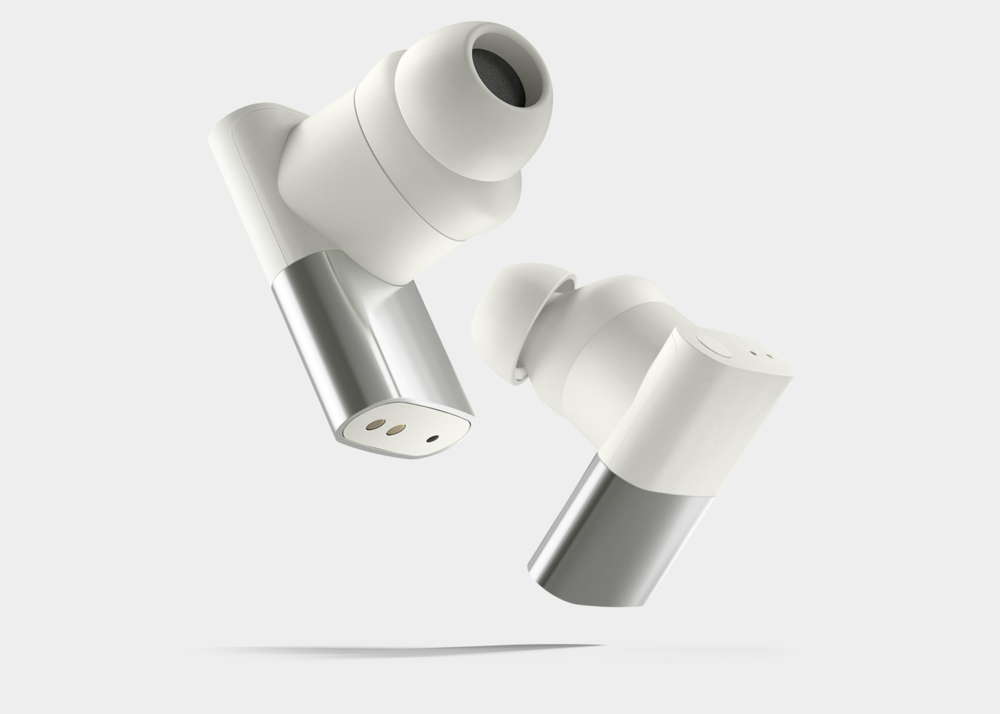
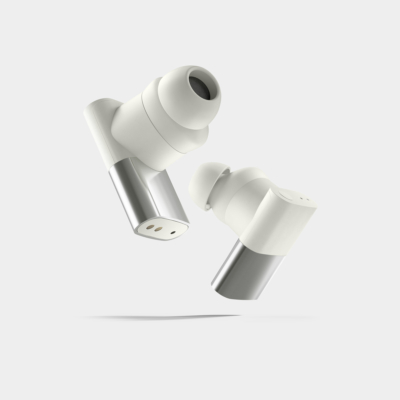
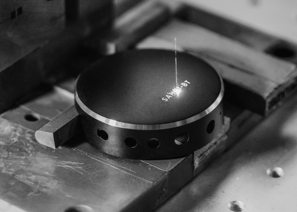
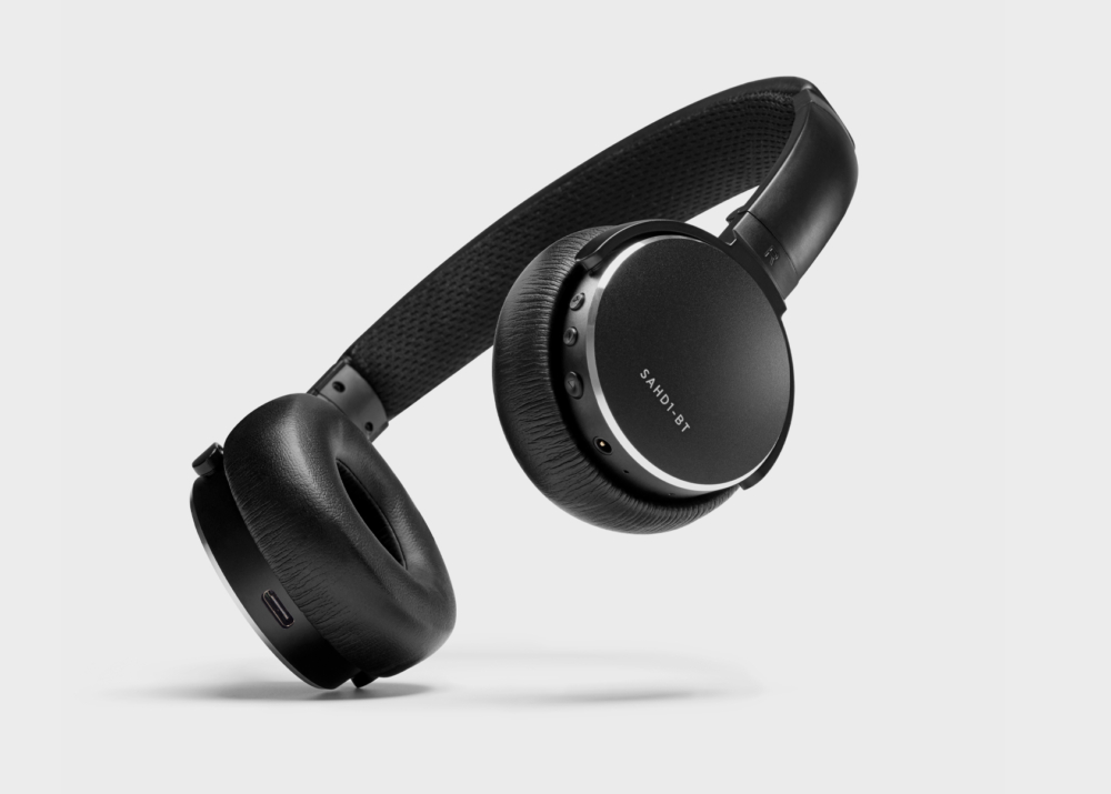
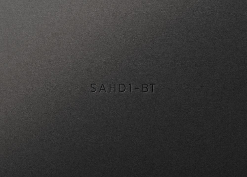
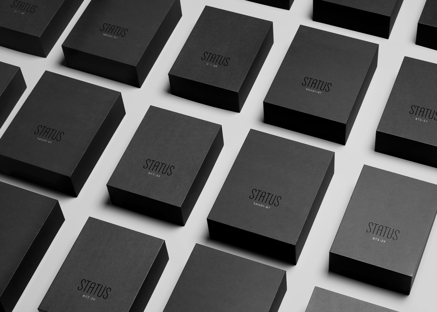
Product ID
On earlier products, a small laser-etched typographic code acted as the sole identifier—offering a subtle, functional alternative to traditional branding. The concept helped establish a core visual philosophy that still informs the brand today.
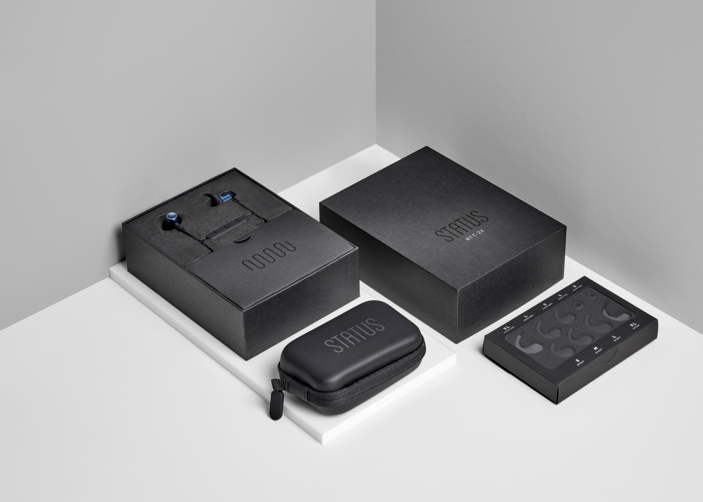
Packaging
Packaging was designed as a modular, universal system to accommodate products of different shapes and sizes. Built for production consistency, the system ensures that overseas factories can replicate the same minimal unboxing experience at scale. Printed sleeves and inserts complete the experience without disrupting the brand’s quiet aesthetic.
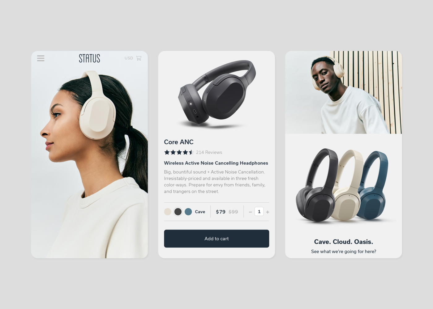
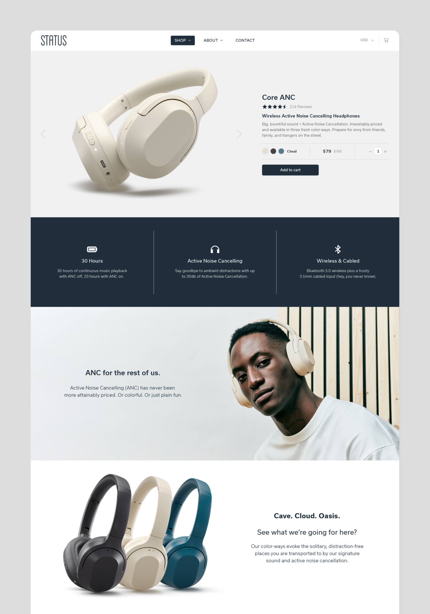
The Online Store
As a direct-to-consumer brand, the website is Status’ primary point of sale. The custom Shopify theme reflects the product’s aesthetic: minimal, technical, and performance-driven. A strict grid, clean photography, and generous negative space guide the layout. The site has evolved across four major iterations, each designed to accommodate new products, users, and shifting shopping behaviors—especially on mobile.
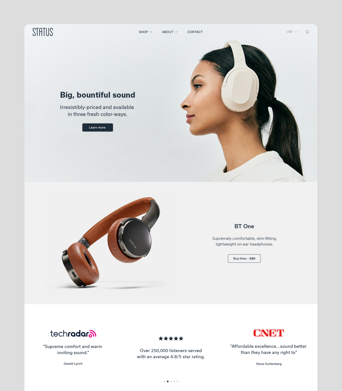
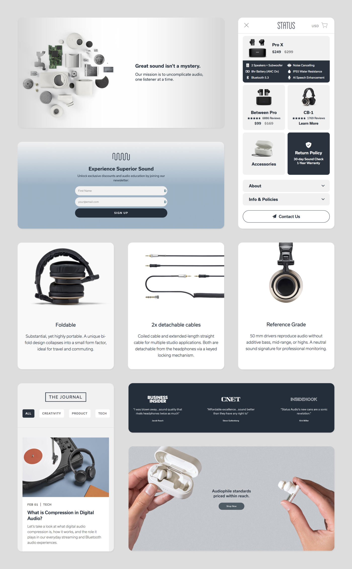
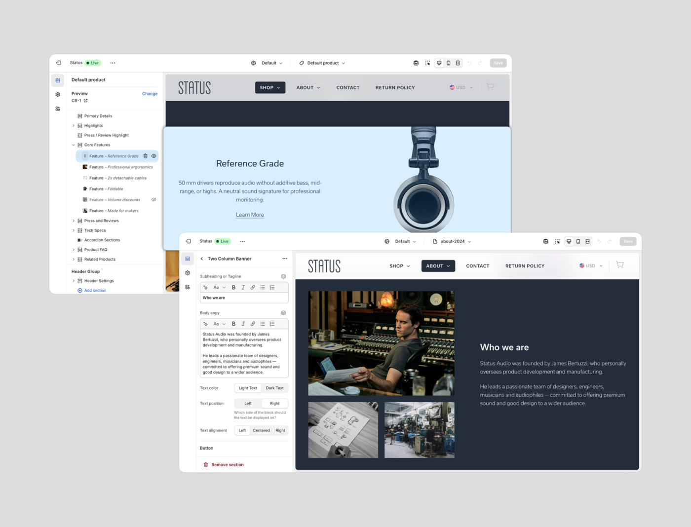
Custom Shopify
Dynamic content blocks were built into the site’s architecture, allowing Status to manage and refresh all of the site's pages without touching code. These sections make it easy to highlight specific features, add media, and tailor the story behind each product launch.
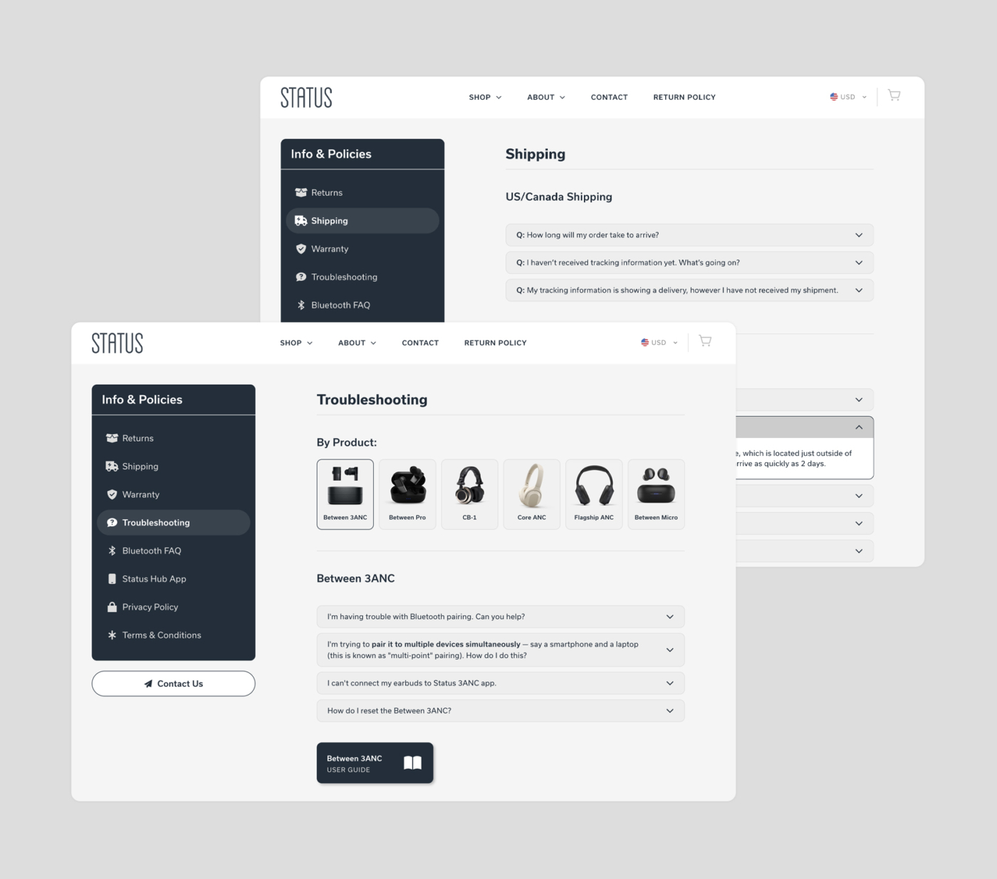
Information Pages
The information pages were designed as a unified resource hub—housing essential content like FAQs, policies, and product support in a dedicated section of the site. Each page follows a modular structure for easy maintenance and a consistent user experience, reinforcing the same visual clarity found throughout the rest of the site.
Over ten years and dozens of product releases, the Status brand has remained true to its original philosophy—putting quality first and letting the product speak for itself. From identity to interface, every design decision has served that mission. The result is a visual system that’s both consistent and flexible, powering the brand’s evolution into a leader in direct-to-consumer audio.